**Preview only**
Be sure to submit your comment
Haha! dONKEY, Your maps are legendary. They are so awesome. Gameplay, Textures everything is exactly right and perfect. 10/10.
Agree (0) or Disagree (0)
@ Mark...
I didn't actually want to have an 8 player FFA..the level was designed purely and simply for 1v1. The map was made for the NoGhost competition, and it wasn't until I was 3/4 of the way through the design and build I re-read the rules and realised the level needed to support 8 player FFA. Like I put in the readme, the FFA is not meant to be serious.
Agree (0) or Disagree (0)
I don't know what the author was thinking having all those bots appear when you load the map in ffa - perhaps to suggest its versatility as both a ffa and a tourney??? i just found this odd because there is no way the author couldn't have known the map was too small for such a large player load. This is definately a tourney map, that's for sure, and anything over 3 players is pushing it. As a FFA i found it chaotic and as a tourney i am in agreement with those who found it more frustrating than enjoyable; it is cramped often times leaving a player snagged in a corner at crucial and inopportune moments. There are other maps out there that convey this sense of tightness without inhibiting player movement. Me personally: i am always drawn to maps that have an intuitive sense of fluidity (anodm3 for example) and while i will defend the author's workmanship movement also possesses an aesthetic quality. For that reason i am giving it a 6.
re the low votes: i am wondering whether the low scores are a result of the voting updates to the site as i moused over to vote 6 and it has come up as 0. i will correct this when we can update our votes.
Edited: 07 Mar 2010 AEST
Agree (0) or Disagree (0)
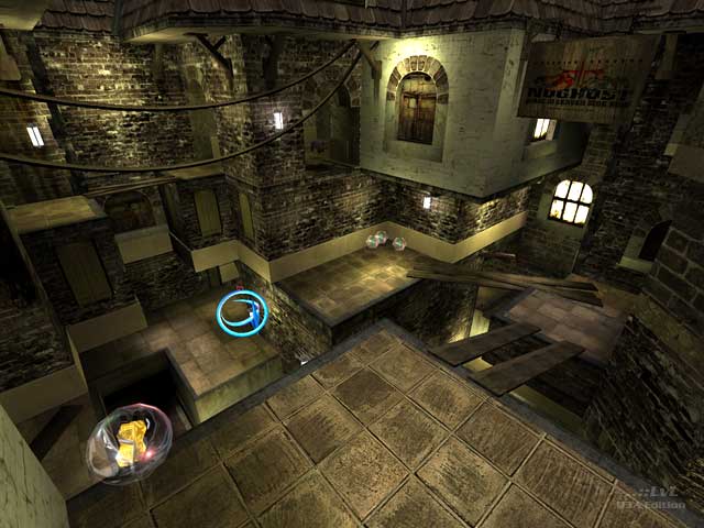
When I looked at the screenshot I was thinking that this map looked like it was a European mining town, until I read the review. I think I got the idea that the map looked like a European mining town from Donkey Kong Country on SNES (Super Nintendo Entertainment System) where you get up to the mining cave levels where you ride the mining carts.
I don't really mind that the level is tight and I really like the bridges made by planks of wood. The lighting gives the map some atmosphere.
This is an excellent map dONKEY.
I give it a 9/10.
PaN61
Agree (0) or Disagree (0)
The issue of scale in this map is less important, in my opinion, than the marked realism that you have achieved in it, dONKEY. I believe that if every mapper, while creating, adhered to the precept, "form follows function", much would be forfeited aesthetically in the final outcome of their constructions. If I wasn't sufficiently transparent in my review, I would like to make it clear that I rather enjoy this map, and appreciate it as it is. I do, however, understand that each gamer has a different set of preferences and a more or less distinct set of features whereby they determine how a map should be valued. For that reason I mentioned in my review that, "...gameplay may not suit everyone's taste...", as I grasp the fact that realism may be trumped by game play for many players. I fully respect the input of those who make comments that express their opinions in a way that is well intentioned, honest, and topically descriptive. I fully agree with sock that a vote as to the quality of a map should then be one that reflects ones personal preferences while still being aware of, and addressing, each of the other attributes that require consideration in the final tally.
Agree (0) or Disagree (0)
Spinolio
unregistered
#9 03 Mar 2010
Fun level, very fast. We did a one-on-one today and was a blast. Nice looking too.
Thanks
Agree (0) or Disagree (0)
Thanks guys, I meant to reply earlier but I'm being worked to death!
I know the map 'should' have been scaled up, but I got very OCD about the scale being realistic.
The dead end jump pad area could/was intended to have been expanded into another section over looking a canal side. Just different have the time to do it.
I'm happy enough with the finished product though :)
Agree (0) or Disagree (0)
I find it strange how anyone can consider a map of this quality a vote of 0.5! I think it is crazy seeing low votes without any reason why because how is anyone here going to know what works or does not when no feedback is given. I can understand if someone does not like the gameplay of a map that they might feel they want to vote lower but a good map is always a synergy both gameplay and visual style and should be graded on both categories.
I know this map was designed to be a tight space for realism reasons but I feel the scale needs to be at least 35% bigger to allow for anyone to have space to dodge bullets and it not to be a competition of twitchy finger reactions only. The jump pad at the back with the strange tech model is totally out of style for me and especially the fact it has a death pit directly below makes it even more annoying. The overall visual style of this map is gorgeous and the vertical gameplay elements have potential but the 'tightness' is too much for my taste, a 8/10 from me.
Edited: 02 Mar 2010 AEST
Agree (0) or Disagree (0)

fKd Rep. 430
#6 01 Mar 2010
was never that big a fan of the maps gameplay spaces, but its well constructed 7/10 from me
Agree (0) or Disagree (0)
Anonymous
unregistered
#5 01 Mar 2010
this map is good
Agree (0) or Disagree (0)

Tig Rep. 2902
#4 01 Mar 2010
Try to ignore the votes. As soon as I get a chance you will need to be logged in to vote.
Update: You now need to be logged in to vote. Also, votes are tracked to a user. This is a quick hack for now and you can NOT change your vote but in the future the code will allow people to change their vote.
Agree (0) or Disagree (0)
It's new "fashion" here :/. Forget about it dONKEY, because we can't do anything with it.
Anyway, congratulations on your latest map, it's great! From me, it's 8.5/10 :).
Agree (0) or Disagree (0)
What the hell is up with these spammers giving maps 0.5 or less? I see Sock got the same for Focal Point.
Agree (0) or Disagree (0)
anonymous
unregistered
#1 28 Feb 2010
Well done, sir! Great achiviement from the look of your first screenies to this final piece of work! Keep mapping some people are waiting for you to complete some other maps. ;)
Agree (0) or Disagree (0)

