Added 27 Mar, 2000
Comments
Add a comment
**Preview only**
Be sure to submit your comment
Be sure to submit your comment
Submitting comment...
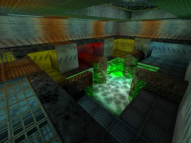
It feels like being inside an aquatic base. It was an interesting idea but could have been executed much better (a wider room perhaps, teleports). Item choice and placement is terrible.
Agree (0) or Disagree (0)
This map actually irritated me . Getting around it and also the bfg in the water with the gl above made most of the dying localized there.
Agree (0) or Disagree (0)
Upon first seeing it- it reminded me of a Q2 styling. But it didn't take long to see one of those weird & ugly rotating hand textures, as on Area 15 so I knew it was the same author. I didn't like the texturing of this one as much as Area 15, but the lighting here was a bit better.
Layout was ok- not really worth the download.
Agree (0) or Disagree (0)
