Added 22 Jun, 2008
Comments
Add a comment
**Preview only**
Be sure to submit your comment
Be sure to submit your comment
Submitting comment...
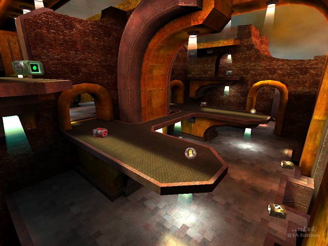
Not the biggest fan of the chosen look on this level, but I can't deny that it plays well. Fast paced and fluid. I never feel like I'm going through any awkward transition spaces looking for the next fight. The level has a great flow to it.
Agree (1) or Disagree (0)
A nice architecture and layout. But the map is MUCH to dark. This gives a nice atmosphere and fits to the design, but at some point a fast and fluent gameplay is hampered.
I have this `darkness problem´ also with some other maps from Nickster. Slipgate e.g.
I have this `darkness problem´ also with some other maps from Nickster. Slipgate e.g.
Agree (2) or Disagree (0)
I actually really like this map :). I love the way you used the layout and textures. :)
Agree (0) or Disagree (0)
A good map. Once again it is symmetrical which makes it somewhat less interesting but it is still good fun with bots. Its also a bit tight but thats just nitpicking really. :)
Good job and needs more attention.
Agree (1) or Disagree (0)
Just a clarification: Each side will randomly spawn a PG or LG. [thanks Mark]
Agree (0) or Disagree (0)
