Added 20 Jan, 2008
Comments
Add a comment
**Preview only**
Be sure to submit your comment
Be sure to submit your comment
Submitting comment...
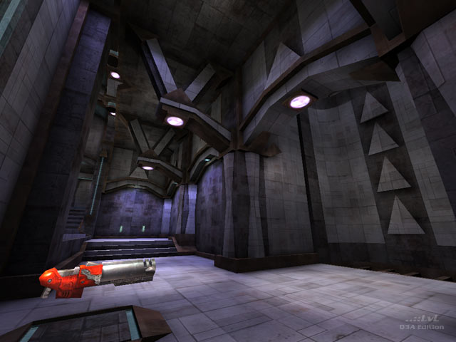
It's maps like this that get me to fire up Q3A again. It was always one of my favs. I had forgotten about it and I might have been the one who posted it here a few years back.
Agree (1) or Disagree (0)
@CZGhost: I agree to. I hate people who criticise other people's maps when they are good plus they cant even create a map themselves.
Agree (0) or Disagree (0)
If there's someone hating the map, then he have to leave community!!!
ra1lc0re says: "I hate the map design, delete it..."
CZghost says: "OK, ra1lc0re, give up your membership card and leave us!"
Agree (0) or Disagree (0)
Excellent map!!!!! The geometry, detailing, lights.......all rock!!!! This map is a must download.
Agree (0) or Disagree (0)
If you've played the original Quake then this map will give you nostalgia. Very bland but expected due to it's competition origin.
The author's other maps are far far more interesting than this one.
Agree (0) or Disagree (0)
It is hard to disassociate map design from the art form that is virtual architecture, and gaming is an ideal environment for its application so as a creative form of architectural design it is a nice level but gameplay is lacking certain features. it lacks overall verticality - jump pad frags are fine but they can be had elsewhere and the predictability factor of this map detracts from the gameflow a good map should empower. Item placement here is its strength. Nade spamming, fringe firing, camping of any kind are all fine in my book as part of a balance repetoire of strategem (infact i lament the backlash that emerged with the BFG - reducing it to the status of a rail gun was 1 of the saddest things to happen in the world of quake - used sparringly its power was part of the flavour of the game. i mean the rl never got relegated to the status of a shotgun). That aside this is where well spread and evenly balanced items draw players into the game but i wouldnt say this is a must have map.
Agree (0) or Disagree (0)
This map was made for a geometry competition 7 years ago and I honestly thought it was forgotten about. When it was released it was not liked too much (too many corridor was the main complaint) and I decided to leave it on my personal site.
Roll forward 7 years and apparently the map has been on a server with people playing around in it! I never expected to hear that news and to top it off Unisaw wanted to review it. The map was all about vertical spaces and creating rooms with layered ledges but unfortunately the wand of "long corridors" also got its way. If anyone wants to play with the source map to change it around for their own needs, the file is on my website.
Thanks for the review Unisaw, your email made my day. :)
Sock
Agree (0) or Disagree (0)
