Added 27 Mar, 2004
Comments
Add a comment
**Preview only**
Be sure to submit your comment
Be sure to submit your comment
Submitting comment...
just a nit pick but im sure Tig wont mind, canyafiureitout is actually for 2 players. I know because i loaded it and could do nothing in it, as I have noone to play with. I was very confused until I looked at the README.
Agree (0) or Disagree (0)
@AEon: re screenshots - that is what they are for :]
As to the SP vs MP, Q3A can do SP maps (see: lvlworld.com/t.php/canyafigureitout and lvlworld.com/t.php/poptart and lvlworld.com/t.php/Botulism and lvlworld.com/t.php/Skeet and lvlworld.com/t.php/Duck+Hunt ), but yes, sadly this map was designed as a MP, not a SP.
Agree (0) or Disagree (0)
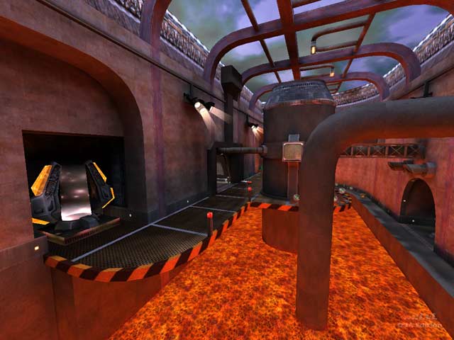
Alas the screenshot used by lvlworld promises more than the map delivers. There are several areas with amazing details, and quite beautiful, but the gameflow is almost completely broken. Too many cramped areas, or gimmicks, that may look cool in a SP map, but in MP really hurt the flow of the game. More play testing against bots would probably have avoided such issues.
Agree (0) or Disagree (0)
The author obviously put a lot of work in the detailing, but the texturing is just way too busy. All the trim, detailed and shadered textures should not be cluttered together like this.
Gameplay is not so special because of the symmetry and crampedness, also there are some dead ends.
Agree (0) or Disagree (0)
Definitely one of the weirdest maps lately... reminds me of the early days of Q3 when all sorts of new engine features ( envmapped surfaces, patches, heavily animated textures, etc. ) used to be cramped in base-styled maps.
I wouldn't play it, but it's good for running around on a short nostalgia trip. 5/10
Agree (0) or Disagree (0)
