**Preview only**
Be sure to submit your comment
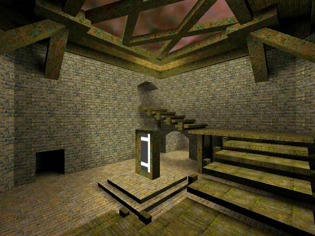
There is no teleporter shader in this map (or there's a missing texture for the shader).
Agree (0) or Disagree (0)
SW12
unregistered
#38 02 Jan 2011
But I like conversions. they are exactly like the maps in the games theryre from
Agree (0) or Disagree (0)
hannibal
unregistered
#37 13 Aug 2001
Lonegunman's Dm6 remake is better...plus it is built from scratch.
Agree (0) or Disagree (0)
Redman
unregistered
#36 30 Nov 2000
nice classic map!
Agree (0) or Disagree (0)
DaHat
unregistered
#35 04 Jul 2000
I am nearly done on a actual remake, not a conversion of The Dark Zone, I will be submiting it shortly.
Agree (0) or Disagree (0)
DeathClaw
unregistered
#34 07 May 2000
Agree (0) or Disagree (0)
mommentum
unregistered
#33 04 Apr 2000
sooo.. QuartZ, what's going on with the conversion? :)
just do it :)
Agree (0) or Disagree (0)
eric Anderson
unregistered
#32 26 Mar 2000
i think it is allright, but i have played and think it haves to have a 9
Agree (0) or Disagree (0)
QuartZ
unregistered
#31 08 Mar 2000
new pic comparing my version of Quake I DM6 to this map...not to say this one is bad, but lets be honest, it takes little work or skill to make a conversion like Povo-HaT's... check out THIS pic:
www.u.arizona.edu/...DM6compared.jpg
NOTE: my map on the right is unfinished and UNVISed, so the fps doesnt represent the final map (neither does the pic hehehe) LateZ!
Agree (0) or Disagree (0)
not entered
unregistered
#30 07 Mar 2000
not bad, a direct port over from quake1 it looks like.. although this map kicks ass.. it needs the good ol q3 touch.. ya know.. music.. ambience.. colored lighting.. and to fix that teleport texture, I'm not sure how hard all this is to do, but I'm sure it's not easy.. just to let you know, your work is appreciated
Agree (0) or Disagree (0)
not entered
unregistered
#29 07 Mar 2000
not bad, a direct port over from quake1 it looks like.. although this map kicks ass.. it needs the good ol q3 touch.. ya know.. music.. ambience.. colored lighting.. and to fix that teleport texture, I'm not sure how hard all this is to do, but I'm sure it's not easy.. just to let you know, your work is appreciated
Agree (0) or Disagree (0)
QuartZ
unregistered
#28 06 Mar 2000
Need suggestions...to add the rail to my version of Q1DM6 or not? Opinions welcomed! Almost done btw with my version!
Agree (0) or Disagree (0)
Claus
unregistered
#27 06 Mar 2000
hmm could have been done sliiightly better... ok though!
Agree (0) or Disagree (0)
pUq3
unregistered
#26 04 Mar 2000
Updated version of Q1DM6 rebuilt from scratch by Quartz?
I am very pleased to hear that =)
Hope 2 see it soon!
Agree (0) or Disagree (0)
Jeremy
unregistered
#25 04 Mar 2000
Quartz - Cool... i look forward to a nice conversion of such a classic map. :)
Agree (0) or Disagree (0)
QuartZ
unregistered
#24 04 Mar 2000
I'm working on it as we speak...I'm gonna send it off to Tim Willits/Paul Jaquays for approval. Hopefully they will give it a thumbs up. Paul Jaquays' stance on conversions says that a map remade from scratch is the kind of conversion they support...well, then I hope my rebuild from scratch will impress them and you. I made new textures, and wrote an all new shader for the teleports...should i give ya a small taste with a screen shot??? mmmmmm, alright.
www.u.arizona.edu/...uartz_q1dm6.jpg
Haven't added any lights yet (the light here is from the purple sky) So this pic is by no means final...whada ya think?
Agree (0) or Disagree (0)
Kaled
unregistered
#23 04 Mar 2000
quartz- do it do it do it. I have to admit that i didn't play much q2, but when I did, this map was my favorite. If you could really update it well, it would be TIIIIGHT. Good luck
Agree (0) or Disagree (0)
Plumpen
unregistered
#22 04 Mar 2000
Good map! Please make a conversion of e1m1 too.
Agree (0) or Disagree (0)
QuartZ
unregistered
#21 03 Mar 2000
I was thinking of doing a conversion of this map (building it from scratch of course) Made to look like it was the same arena say 50 years later.. Giving it the look of a battered war ground, with new nextures that appear to be like the old ones, and updated archtecture, with curves etc, but it would still LOOK like DM6. If people are interested in a quality update of the original map, let me know. I'm sure you have seen my work, and I could whip up this map in a few days (I don't have to test the game dynamics cuz it's tried and true) I think these kinds of conversions are BAD! This map looks/plays horrid under the Q3 engine, but a fresh DM6...ahhhhhhhhh, lemme know!
Agree (0) or Disagree (0)
ezkimo
unregistered
#20 03 Mar 2000
octovus: it's not the same. quake3 has different physics. if you can play it in quake3 and have it feel exactly like it does in quake1, you either suck or you're not very bright. :)
Agree (0) or Disagree (0)
Gila
unregistered
#19 02 Mar 2000
Damn another conversion.
THEY WILL NOT BE GOOD AS IN ORIGINAL GAMES!
The one and only conversion of Dm6 that is really good, with curves and stuff is made by someone... Really great.
And this conversion sux.
Agree (0) or Disagree (0)
Jim
unregistered
#18 02 Mar 2000
2nd map this week that gets a zippo from me...
I do have to admit, the "original" was a very nice map, but in Q3 its just way too bland- just look at the bloody screenshot for cripe sake, there's nothing there. And the missing texture- there's just no excuse for that.
Veni, vidi, deleti.
Agree (0) or Disagree (0)
ElWooD
unregistered
#17 02 Mar 2000
At least some people are trying to recreate GOOD dm10n120n2 Structures.
Going back to something you are familiar with is easy.
A PROPER Q3 Conv would be good, but if you don't do it you can't complain.
It ain't a company man, not yet!
Peace
ElWooD
Agree (0) or Disagree (0)
not entered
unregistered
#16 01 Mar 2000
I too have been waiting for this level for a while...it was the best one q1. Me and my friends would play it for hours. However, i am slightly disappionted with this conversion. The lighing in parts is very bad and the teleport texture was missing. Other than that, this was fun to play...i just hope someone else out there makes a better one
Agree (0) or Disagree (0)
ALS
unregistered
#15 01 Mar 2000
conversion sux
Agree (0) or Disagree (0)
MrGTI
unregistered
#14 01 Mar 2000
It always was a good map. But in Q3, the textures look way too 'blah'. A slight modification would have been nice. As well, the 2 alcoves are totally pitch black - that should have fixed. And the teleporter texture is missing/bad. If some of these things were fixed up, it might be worth playing.
Agree (0) or Disagree (0)
rebuke
unregistered
#13 29 Feb 2000
the maps average the bots tend to stand around the middle section so u pinnaple them to death. Also the texture are soft.
Agree (0) or Disagree (0)
Alex86
unregistered
#12 29 Feb 2000
this map is Rulezzz except one thing a bit starange lighting and wrong texture. But Gameplay is RULEZZZ.I have been waiting this map for 3 month!!! And Now I play it!!!
Agree (0) or Disagree (0)
Alex86
unregistered
#11 29 Feb 2000
to Octovus
Sorry, I have clicked wrong button
Agree (0) or Disagree (0)
Alex86
unregistered
#10 29 Feb 2000
This Map was the best map for both q1 and q2(IMXO). Let it live in Q3A
Agree (0) or Disagree (0)
Octovus
unregistered
#9 29 Feb 2000
This Map was the best map for both q1 and q2(IMXO). Let it live in Q3A
Agree (0) or Disagree (0)
Octovus
unregistered
#8 29 Feb 2000
Ok it was both ur comments then... =)
Agree (0) or Disagree (0)
AssBall
unregistered
#7 29 Feb 2000
yeah it was my comment, about feeling it might as well be quake 1 for how bland it is.
Agree (0) or Disagree (0)
Octovus
unregistered
#6 29 Feb 2000
That wasn't Assball's comment it was Bad_To_The_Bone's... and besides I think all he meant was the screenie, not the level (can't say as I know, haven't bothered to dload the thing). =)
Agree (0) or Disagree (0)
Tigger-oN
unregistered
#5 29 Feb 2000
AssBall - besides the missing teleport texture, this is exactly what the original looked liked :]
Agree (0) or Disagree (0)
[iF]Gonad
unregistered
#4 29 Feb 2000
read my SiNdm9 comments: I think it completely sums it up. (mine are the last 2 comments made on that map)
Agree (0) or Disagree (0)
Octovus
unregistered
#3 29 Feb 2000
Another one? Tig, I understand that you probably have some on your que already, but
PLZ don't take in conversions.. I haven't dloaded this yet, but no doubt it will be much like others... if mappers out there really like the layout of a certain map, sure convert it, but make it Q3 too... you can have the layout of a map without having those textures (if you can call them that) from good ol' Quake thrown in... because if you do do it that way, the only difference is in the actual weapons available, and if you manage to keep that original...
Why the hell would you convert it, just play the original . Just my thoughts..... conversions are getting very tiring, while new maps are getting more and more interesting IMHO.
Happy Fraggin! Octovus
Agree (0) or Disagree (0)
Bad_To_The_Bone
unregistered
#2 29 Feb 2000
I reckon the buity of the original was its simplicity. There are no buttons opening lava traps or anything like that. And the architecture is nice and simplistic unlike the overbearing architecture of other maps. I'm not sure whats going on with the teleporter in that screenshot though.
Agree (0) or Disagree (0)
AssBall
unregistered
#1 29 Feb 2000
Umm... I never played the original, but I felt like I might as well be in the original since the texturing was so poor. No detail at all. I say if you are going to submit a map for public perusal, at least spend some time making it look nice. The layout was decent, that is about it.
Agree (0) or Disagree (0)

