Be sure to submit your comment
Edited 22 seconds after the original posting.
The poor gameplay will probably be the same for tm5 with an additional note of TOO DARK :)
Good tm guys,
and the .aas not loaded... yeah, the original .pk3 had a bad version of it... thought the pk3 had been updated since... here's a fixed .aas for that.
scampie.spawnpoint...ampie_patch.zip
also, I have the .map availible for anyone who wants it. it's the the LvL Open Source liseance, but pretty close.
scampie.spawnpoint...scampie_map.zip
(and I agree that Scampie's map should have been in the top half at least)
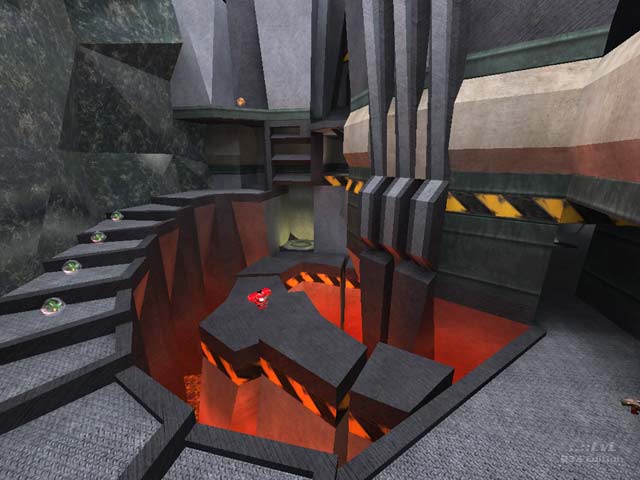
MYTH- you're right, it is a tech-styled map. I looked at the screenie when i was writing the review and between the trees and colors- I thought: roman ruins.
SCAMPIE- I hated putting your map last because I love your maps from Speedpack 100,99,133, etc. This map just didn't do it for me personally. (I also couldn't get the .aas file to load, but tried not to let that influence the review).
Eventually I might get around to releasing the texture set I made for my map :-P
Finally the review is here though.
That's funny, I remember mine being a tech/space theme with a cave. Quite how you get to Roman ruins is truely beyond me.
lots of great maps in this pak, WviperW's was the best IMO. I remember his, Akuma's, Equim's, Myth's and Shallow's being great fun to play. all of those could easily be standalone, releasable maps with a little tweaking (in fact, I believe WviperW did just that).
The rest were pretty good for the time they were given, AD5's has a great looking center area and a nice overall theme. Monsto's map is nice looking, and is an original idea, but feels a bit disjointed in the way it works. and look on the screen on Gear's map! there I am! chatting away when I should have been mapping harder ;D
Good job to all those involved.
P.S. was my map really the worst in the pak? :(
it confuses me what the reviewer means by "Only way to upper levels is by climbing quarry wall."... does he mean the staircase, or did he somehow miss that?
