Added 04 Aug, 2002
Comments
Add a comment
**Preview only**
Be sure to submit your comment
Be sure to submit your comment
Submitting comment...
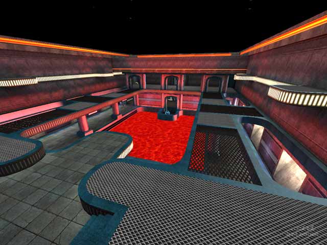
ive been playing this map for a year on jb's server, it is 1 of my favorite maps to play, as it was as house of chython, back in q/1 days, the recreation of this map was a blessing, because of its simplistick layout. i think the author (i.e} jb duplicated the maps original layout to a tee. as far as disco lighting im sick of other peoples bland maps with drab colors this is a pleasure to look at. keep up the good work jb. dont conform to the bland lovers
Agree (0) or Disagree (0)
We have played this map on my server for about a year now without bots. Most people that respawn on the top platforms jump down to the top level to get the SG at one end or the GL or RL at the other end. And when people jump down to the bottom floor they like to get the PG or RG. I tried to make spawn points and item placement as close to the original as possible. This map was basically a shader excersize so i could learn more about shaders and textures.
Agree (0) or Disagree (0)
heh, I agree with what you've said about the shader effects and game play Shallow[BAP], but I think that game play part is due to it being a copy of the original Quake1 map.
The reviewer does say that the Game play isn't great here: "This would have given players on the lower level more scope for retaliation against grenade lobbing adversaries, or those wielding railguns above more variation than pure horizontal shots. Players on the lower floor would have more to be wary of, but many of the spawn points are further up, with people only venturing down for the lightning gun and Quad damage anyway."
I guess he didn't want to say "The game play here is crap" ;)
Agree (0) or Disagree (0)
The disco vibe is actually fairly nauseating, and there are some weird distortions on the surface of the lava that could easily have been fixed had the author been bothered. Botplay was very uninteresting because the layout is somewhat uninspiring... The House of Cthon wasn't primarily a DM map after all.
I rarely post comments here but on this one I felt compelled to because I disagree with the review so strongly. Although most of the construction is OK it's really a below average map with poor gameplay and too many horrible shader effects.
Agree (1) or Disagree (0)
