Theoretical Probability
Theoretical Probability by Lake Trout
Comments
Add a comment
avatar
**Preview only**
Be sure to submit your comment
Formatting help
Submit
Preview
Cancel
Submitting comment...
avatar
HelterSkeleton Rep. 6676
#13   23 Jan 2021
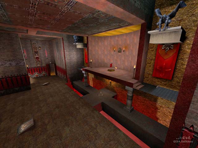
based on the weapon load alone, this level could house up to 28 players, although it would be a bit crowded in places. Not much use for a map of this size now but it would have been great at the time where large LANs were still a thing for Q3. Also found the lighting to be very atmospheric in places although one has to be careful here: while darkness can be atmospheric it also compromises visibility. A teleport instead of medikit might have been useful, especially considering the number of pitfalls, and the fact there are already 2 regens and MHs, but for a map this size I don't think the power-ups are too many. What did bother me though was that some items were hard to get too (e.g. MH). I get there are weapon jumps but there should also be an alternative (a teleport, spawn location, drop down, or room for a skilled strafe). There were also many pointless areas: bouncepads to ledges that just didn't go to anything (there was a ledge jump to a single green health). Given the potential player loads, some YAs would have been more rewarding. not the prettiest map, and oftentimes annoying, but still engaging.
Edited 3.68 minutes after the original posting.
Agree (1) or Disagree (0)
VisionThing unregistered
#12   20 Jun 2002
laughs at fool not realising that the id# shows that he made all of those recent posts under different names
Agree (0) or Disagree (0)
how sad unregistered
#11   18 Jun 2002
most of these comments are from the maker himself trying to make it look good
dont cry just because no 1 likes your sucky map that sucks my ass all day long and likes to lick cow nuts

just dont cry about it

Agree (0) or Disagree (0)
Majin Tenshi unregistered
#10   17 Jun 2002
BIG MAP!!!

Very cool!

Almost as big as a Halo map!!!

AWSOME!!!

Agree (0) or Disagree (0)
Majin Tenshi unregistered
#9   17 Jun 2002
What the heck are you all on about!?!

This map is great!

Despite its lack in texturing...

IT'S BIG!!! That's what counts. I'ts big enough to fit 16 players or more. The more, the merrier!

Agree (0) or Disagree (0)
VisionThing/<SuX0r> unregistered
#8   12 Jun 2002
Oh yeah, I'm not 2 people I'm just in the process of changing my name as I will have good ping soon :D.
Agree (0) or Disagree (0)
VisionThing/<SuX0r> unregistered
#7   12 Jun 2002
I would also have to agree with Brad Kiefer and now Tetzlaff.

I think Tetzlaff has it pretty much summed up tho' so I don't have a lot to add other than; 3 powerups in each base is just overkill and all the major items are placed in out of the way places (not just the regen) which does hamper gameflow considerably.

Anyways just putting another viewpoint in as I only downloaded this level after reading the comments and I don't like to see people thinking their work is being unfairly criticised. The review could have been more constructive it's true but the points are valid and the comments board will often provide constructive criticism if the review doesn't (thanks for saving me some typing Tetzlaff :p). Look forward to future work :). Cya!

Agree (0) or Disagree (0)
Tetzlaff unregistered
#6   11 Jun 2002
Sorry, but I have to agree with Brad Kiefer´s review, the flaws he points out are all there and very obvious.

OK, I try to reduce my comment on some constructive criticism:

-try to use the textures in a way that they enhance the look of the architecture. If a wall is plain and boring, it will not look better if you randomly throw nice textures on it, no matter how good the textures may look by themselfes. Textures should never change in an aprupt and pointless way. If you have for example a stone wall, then make sure that it looks like a massive stone wall from all ankles, not like a brush with a stone texture on one side and an iron texture on the other side.

Jumppads should only be used where it makes sense, similar to elevators or stairs. A stair that just ends on a wall wouldn´t make much sense, and it´s exactly the same with jump pads. In your map there are jump pads that lead to a tiny ledge with only a 25 health sphere, which doesn´t make any sense at all.

Risky placement of powerups doesn´t necessarely mean placing the PUs in very hard to reach or very cramped spots (because gameflow is still most important!). In CTF teams like to battle it out around items, so a risky place in that sense is for example the open battleground in the center of the map.

I´m sure it´s nice for you that the reviewer on denken.com wrote so positive about your map, but he obviously doesn´t know too much about good level design. You surely will get better when you receive honest feedback. It´s your first release, so it´s no shame that there are many newbie errors in it. But if no one points them out, how should you learn?

Don´t take it personally, and good luck with your next map ;)

Agree (1) or Disagree (0)
maladon unregistered
#5   10 Jun 2002
notime apparently has spent notime playing CTF.

We play this map at our lan parties and it's a favorite. We twelve or more at the parties, so it's great to have a big map.

Agree (0) or Disagree (0)
Lake Trout unregistered
#4   10 Jun 2002
Another nice comment by the Deathmatch Zone:
www.denken.com/dzone/q3maps02.htm
Agree (0) or Disagree (0)
Lake Trout unregistered
#3   10 Jun 2002
Here is the link to the contest this map won...
www.denken.com/dzone/contest02c.htm
Agree (0) or Disagree (0)
Tigger-oN unregistered
#2   10 Jun 2002
Do you have a URL link to the review on Deathmatch Zone?
Agree (0) or Disagree (0)
Lake Trout unregistered
#1   10 Jun 2002
Nice to have some constructive critisism, here... 'notime' obviously didn't like it, but this map DID win the Deathmatch Zone Holiday Mapping Contest back in December and it has been a hit at our LAN parties. It also has been downloaded 450 time at File Planet. The lighting and textures change, Brad, because it's a CTF map! I had a lot of positive comments about the Regen with the skeletons. It was even shown as one of the screenshots in the Deathmatch Zone review. Think about the irony of the combo. I think Brad wants every item really easy to get to, but in the reading I did about CTF maps, it was said that the powerup items should be placed in positions of risk, which they are. The center "atrium" has one "cluttered" spot because I thought it would be neat to have part of the ceiling fall on the floor. This then doesn't make the map a "true" mirrored map, but so what? As far as "amount of stuff" I worked long and hard and got beta testers feedback a number of times. I can take a poor review from someone, but to just trash a map just to trash a map without ANY constructive feedback is a very bad thing. Remember, this is my first release. All in all, I still think the map is a good one. If anyone else thinks so or agrees with the reviewer, please post, but remember, constructive always helps whether bad or good. Thanks, Lake Trout
Agree (0) or Disagree (0)
Clear