**Preview only**
Be sure to submit your comment
Frib is right they call me Mr.Nighmare and still I can barely play this
For rocket jumpers it must be a pain in th ass!
Agree (0) or Disagree (0)
Cap'n KRUNCH
unregistered
#18 20 Feb 2000
This level didnt quite grab me the first couple of times I played it. The look and flow of the map seemed haphazard, not quite as crisp and tight as an id level. And repeatedly dying from the unnatural short jump from pad to the red pit o’ death had me scratching my head as to what the author was thinking.
But from watching people play and discovering the tricks at a LAN party and many games in the office, I must say that this is a fun map, and slowly grows on you as you discover all of its intricacies. The fun bits are discovering the routes along the ledges, the places to lay in wait, wreaking havoc with a Rail or BFG. Your skilz are put to the test by slamming on your air brakes to get the grenade launcher, navigating the street-level ledge, or by grabbing the insanely placed BFG.
The true meaning of this post is that I would have discarded this map were it not for subsequent playings. Though a little rough architecturally, when you know its ins and outs, it’s a blast to play.
Agree (0) or Disagree (0)
Redrum
unregistered
#17 24 Jan 2000
Thnks Jonny...
Agree (0) or Disagree (0)
Johnny
unregistered
#16 23 Jan 2000
www.thect.com/maps/Maps/jnyaas.zipGoto this url and extract the .zip file into your baseq3/maps directory, it will enable bot support for this map.
Agree (0) or Disagree (0)
Rocket Racer
unregistered
#15 16 Jan 2000
The first custom map to truly impress with its complexity.
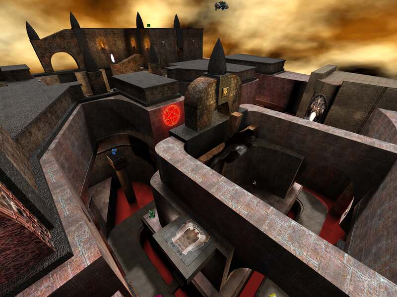
Phantasmagoria looks and feels like something out of an old film set -- think Hammer Horror, c. 1960. Gothic and menacing, it leaves you either balancing on its tightrope lanes or taking a harrowing ride over the rooftops (and through the narrowest cross of a window). A cool map in every respect, and rare in its ability to evoke emotion.
But there's more. Something about Johnny's work says "the future of mapping" -- a direction toward more realistic architecture and a more crowded, layered aesthetic. Really, where most levels are mere slices of a structure or place, Phantasmagoria is like a few city blocks crammed together. The way it flouts the rules of the conventional mapping scene is irritating to some of the old guard who can be a bit precious with their statements about "quality" (see comments below), but very welcome to the rest of us who want something new and fresh. Anyone who likes originality should download this map.
Keep up the good work, Johnny. And for chrissakes, please do a bot file for this one so its admirers can play it!
Agree (0) or Disagree (0)
Andy'sAlien
unregistered
#14 06 Jan 2000
THIS MAP IS NOW A PART OF MY BIG CoLECTION FOR MY NEXT LAN PARTY
Agree (0) or Disagree (0)
serial thrilla
unregistered
#13 05 Jan 2000
am I the only person that doesn't have Q3 but still looks at the map reviews?
Agree (0) or Disagree (0)
Grom
unregistered
#12 03 Jan 2000
Liked the feel of the map, and the brushwork; thought the jump pad that shoots you to the side through the oval window was great fun. However, there were some things that jumped out at me. Firstly the portal floating in the air that you get to by way of the chained jump pads - looked really out of place :/ Also don't really get the idea of chained jump pads - the one in q3dm9 or whatever is good, as you can access a lot of items by going on the full chain, whereas on this map it just seemed an excuse to push the player on a fairly pointless rollercoaster until he just teleported somewhere else.
The other thing was, this is the first map to really crawl for me in Q3 - I've got a P2-450 with GeForce, and it actually got down to 2fps in some areas. I seriously could not play the map at all because of this.
Regards, Grom
Agree (0) or Disagree (0)
Jewels
unregistered
#11 02 Jan 2000
After playing Aplified Sample for q2 I knew this lvl would be a nice pick for me. The fog of death is really a nuisance making me be more careful. (In the space lvls people shoot me off the edge alot :] And items in hard to get places are good coz then people won't be getting them all the time, but you could have put more ways to get from the bottom to the other lvls.
Agree (0) or Disagree (0)
Alu
unregistered
#10 02 Jan 2000
Been playtesting it since it was one room with 2 jump pads. Shows a lot of good ideas, now you just have to put them together in a clean fashion so the map flows.
Agree (0) or Disagree (0)
Mr. Shit
unregistered
#9 02 Jan 2000
nice map pa1nz.. but as i said before.. ehe u rushed it :> still pirty though . Ps frib this map wasnt made for fun.. it was to test the engine to c what it could do.. i dont think he intended it to b a fun map just a good test to c wtf q3 can do.. and as i said before.. it is pritty :>
Agree (0) or Disagree (0)
Johnny
unregistered
#8 02 Jan 2000
All the guns are NOT on the upper level. The super shotgun, lightning gun, and railgun are all on the lower level. Did you even play the map man???
Agree (0) or Disagree (0)
ProdigyXL
unregistered
#7 02 Jan 2000
I have to agree with the rest. The item placement is just terrible in my opinion. All the weapons are on the upper levels and difficult to get. Also seeing the bottom of the bit on the lower walk ways is lame. Also som of the textures are not aligned on the curve's caps. Next time don't rush something out.
Agree (0) or Disagree (0)
Peej
unregistered
#6 02 Jan 2000
As I said n PnF, i pretty much agree with Frib. the map shows good ideas etc, but the quality just isn't there, it's very bitty and looks poorly put together. don't worry tho johnny as these things take time, esp with a new game engine.
Agree (0) or Disagree (0)
Sompan
unregistered
#5 02 Jan 2000
When I saw the Screenshot i was thinking:
"Damn... cool LVL"
Agree (0) or Disagree (0)
GibFest
unregistered
#4 02 Jan 2000
The screenie looks good and I look forward to playing and reviewing it. Just waiting for Quake3
Agree (0) or Disagree (0)
Frib
unregistered
#3 02 Jan 2000
I apologise again Johnny, I don't mean to beat on your map, but I'll attempt to justify my comments and respond to some of yours - even though I'm going to look like even more of an ignorant asshole when I'm finished.
Firstly, I didn't say the lighting was bad or 'bland'. I said it was unimpressive. It was unimpressive because it failed to impress me. The reasons are largely irrelevant, and in fact I don't know them myself. Some things just are.
"How can people dis on standard sky lighting?"
- people can dis on anything (:
"When the entire map is an open arena this is way lighting is done."
- who said the entire map has to be an open arena? I didn't.
Furthermore, why is that "how it is done"? Are these things set in stone? The whole point of being able to edit the game is that you have the option of changing stuff. If you're content to simply repeat everything 'the id way' then I am not really looking forward to your future maps. :(
"I've never seen anyone comment on any of the id maps that are outdoors being too blandly lit"
- no, I haven't seen that either. However, had you have asked me, I would have probably said the lighting in those areas was 'unimpressive'.
"Does the Parthenon look like a laser light show?"
- is this map q3ParthenonDM1? In any case, I never said anything about laser light shows.
"I really cannot see any validity in that argument Frib"
- fair enough. No doubt that won't change after you read this.
Finally, though it shouldn't need to be stated, these are just my opinions. It is widely known that I do not in fact have any idea what I'm on about, and in addition to that I am incredibly fickle. With that in mind, if I said something you don't agree with, just disregard it. It's probably just uninformed, irrational rubbish.
Agree (0) or Disagree (0)
Johnny
unregistered
#2 02 Jan 2000
I can understand most of your arguments Frib and will not dispute them. But one thing is beyond me. How can people dis on standard sky lighting??? What am I supposed to do, somehow reverse the natural light givin off by the sky, then add a s#!tload of light entities? When the entire map is an open arena this is way lighting is done. I've never seen anyone comment on any of the id maps that are outdoors being too blandly lit, and I mimicked q3dm7 very closely here. I used torches as well. I've even used light coronas for a halo type effect. What else am I supposed to do? I refuse to make my map look like a kaleidoscope on crack because sky lighting seems too bland. Does the Parthenon look like a laser light show? No, and it shouldnt because its outside, in natural lighting. I really cannot see any validity in that argument Frib, but you're pretty much on point with the rest of them.
Agree (0) or Disagree (0)
Frib
unregistered
#1 01 Jan 2000
I'm not too keen on this one, sorry Johnny :|
It seems kinda all over the place, some brushes thrown here and there, a bit purposeless and not cohesive. Lighting was unimpressive.
As we know though, gameplay is king, which is why I can't stand this map. I keep falling into the fog-o-death crap every 2 seconds. Why does it have to be everywhere?? Even on the INSIDES of all of those walkways. No matter where you step, you fall and die. I'm a reasonable player too, it must be hell for newbies.
Part of the problem is that Q3 simply lacks any real movement control, but that's something you're going to have to compensate for, rather than making maps which require precise movements.
Agree (0) or Disagree (0)

