Be sure to submit your comment
Edited 1.22 minutes after the original posting.
What I didn't at all was moving around because the angled floors always let you bounce around more than run.
I'm going to disagree -
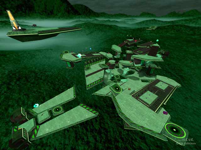
First off--a visually stunning map, textures & lighting are beautifully matched, the lighting subtly brings out the great brushwork & enhances the feeling of space.
gameplay--the first 5 minutes in, I would have agreed with the others here; seemed like 2 many jump pads that led to a SG or no weapon, and it was hard to score because the bots threw themselves off the platform near the bfg ammo just as fast as they could. But it was so pretty that I stayed in to check out all the parts of the map. As I learned the map I started finding good fast routes & something clicked, all the areas made sense & I saw that this map would play very differently with human opponents--the opposition of the RG & RL with good cover & lots of vertical action, no wasted space but no tightropes either---it's like a better "Longest Yard" only you can't tell from playing the bots. Definite influences from Nunuk & Pete Parisi, but I think DECAY has pulled it off well & made something better than good. I like the sloped floor & crossing "corridors" at the RL, & too many other details to mention. 9 from me.
---e
Haven't actually 'played' it due to me getting dizzy from the HOM effect, but the lvl looks pretty cool. I agree about the gimmicks though. I understand something like the gimmick on Cardigan's spacemap, but I don't really like the "10-rockets-coming-at-you-every-5-seconds" gimmick.
Aesthetics look very nice though, you can definately tell its nunukian-inspired. Might be a bit too green, but thats alright, I like green. :)
Do you think I am just a little biased against space maps? :)
Anywho. Um, the bots suck at this, as must space maps, lets get that out of the way. In the readme the author aspires to people like Nunuk and he's getting there, certainly in theme and ideas but a key bit is missing: the traps and tons of platform/bouncepad combos (makes me feel like a jumping puzzle in MP) are just way too gimmicky to make a cohesive map. Gameplay over gimmicks, and that's all the author needs to make a top notch map. However, that's one of the hardest parts to get right.
There's really not much to this map as far as real play is concerned, with way too much falling off hapenning even with people (though the author does say the two PTs were added to assuage this, true enough). Three traps is a bit excessive, as I've said. Also, floating items are cool, but putting 4 ammo boxes in a row really isn't...
Er, 6 from me; it's not bad, but I think PI is showing a bit of anti-space bias with his concluding sentence.
-Octovus
