Be sure to submit your comment
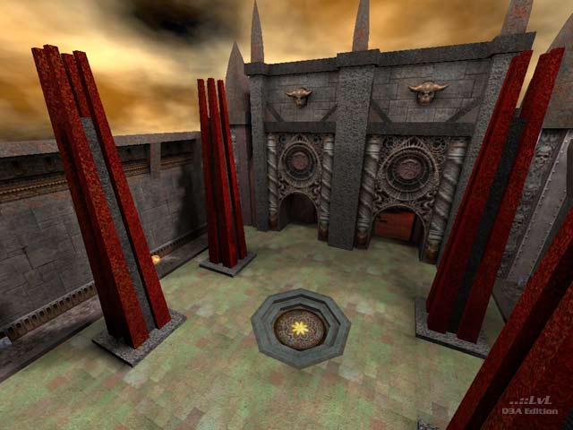
The RL is put into a "spam from heaven" style room, that has only small entrances and then a stairway going up. Adding to the attractiveness of this deathpit is a MH in the room. Putting a grenade launcher right behind either of the side entrances to here is silly, it makes for even more of a spamfest in a map that is already too tight to make non-splash weapons useful (at least the reviewer recognised this; the map features sg, gl, rl, lg, pg and they're the full complement of close range q3 weapons).
It's way too hard to get back down once you go to the top, so the red armor is not enough attraction unless you're playing tourney (in which case there is way too much health and armor/armor shards floating around). A teleport to get back down might have been nice, and helped relieve some of the "spamtastic"ness of the lower chamber. Either that or a connection from the LG end of things.
It was ok, fine technically, and had some semi-classic gothic architecture; however, the map is just so small and so full of health/armor/spam weapons that it neither makes a useful tourney or a fun FFA.
6 from me, but don't be discouraged by anything anyone says, I always look forwards to everyone's next works :-)
-Octovus
