**Preview only**
Be sure to submit your comment
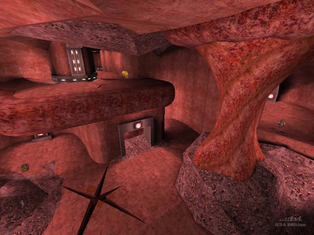
interesting idea and novel use of the iD flesh/organic textures but my issues with this map mainly have to do with movement (the unevenness of the floors) and the health (that could have been more widely spread across the map). I appreciate that the curving corridors are meant to reflect an intestinal interior, but unfortunately it has a negative impact on connectivity and navigation. still fun.
Agree (1) or Disagree (0)
Haha! Very clever idea for a map. Textures are not bad a lot more needs to be done to improve the map. 7.5/10
Agree (0) or Disagree (0)
Nitebeat
unregistered
#17 27 Jul 2002
:-B right.. lol been a while heh
Ok I did play the map. Well uhm.. sure as hell something different ;-)
Agree (0) or Disagree (0)
Nitebeat
unregistered
#16 01 Jan 2002
At first glance:
Original looks,design. LIke it :) Feels like running around inside the body of a fellow fragger :D
(klesk ate me?)
I haven't played it yet, I'll be back with a full review :)
Agree (0) or Disagree (0)
d4_dr3dw3rk2
unregistered
#15 22 Oct 2001
gr8 map! low rspeeds on crappy computers but thats nothing 4 me 2 worry bout on my 1.6ghz tnt2ultra!!! HAHAH!!
Agree (0) or Disagree (0)
Dubya's an a-hole
unregistered
#14 27 Sep 2001
First octovus, If you have problems running that map you really nead a new computer. What do you have a 233 with a tnt1? I have a p3600 and it ran great. Second, Dubya, this map is a hundred times better than any map you could make. I like this map, I thought it was different. You make it sound like it's so bad no one should download it. I think it's worth the download.
Agree (0) or Disagree (0)
Dubya's IQ
unregistered
#13 22 Sep 2001
This map is awful. Gameplay is boring and stupid. If the organic textures were replaced with normal textures it would be painfully boring.
Did I mention that the map is ugly? Well, it is.
Too bad, because it's a very cool idea to make a gutsy map with organic texures, but the implementation is way off.
I give it a 10, minus 6 for sucking so hard. Better luck next time, EASE, and try approaching mapbuilding as if it isn't all that "easy".
Agree (0) or Disagree (0)
Rail-Whore
unregistered
#12 17 Aug 2001
An LSD trip at its best!
Agree (0) or Disagree (0)
Octovus
unregistered
#11 11 Aug 2001
Well, I don't imagine with all the moving bits and nice shaders turned on you could really solve the "problem" of r_speeds/framerate etc. in this style of map. If I was going to be playing this because of awesome gameplay, and not because of a combination of a very cool idea and of perfectly good gameplay, then I'd just turn my settings down.
So I guess I forfeit my right to really complain about r-speeds, but hey :-) Beggars can't be choosers! Btw, the cracks and the fluidy shader jobs on some pillars/surfaces etc were very cool, even if they didn't help my poor little brain figure out where I was....I'm probably just too stupid :-p
-Octovus
Agree (0) or Disagree (0)
Ease
unregistered
#10 11 Aug 2001
Octovus, I dont get to confused in my map but thats probably because i made it : (
It would have probably been easier to navigate if I had a better skin/organic texture set to work with but what id shipped with the game is not really enough for a whole map. but i decided to run with it anyway but looking back thats the biggest thing that bothers me, all the textures pretty much look the same
i tried to spice it up a little by adding a shader on the floor where it looks like there is fluid in it moving around and split the floor in some places to look like a crack in the skin. still there may not be enough landmark features unfortanatly. i suppose i could have used some differnt colored lighting to break up differnt rooms of the map too, but I didn't feel that any other colors of light were going to work well my limited texture theme.
oh well, that CTF mod tribal war or whatever.. it is has a nice sorta of alien organic map with cool texture : )
oh and just out of curiosity does anyone have any thoughts on a way i could have better optimized the map for speed without changing the look? I played the map with 6 people and they all said it played fast enough on systems with their detail level/settings so I was happy with it but maybe I could have done a lot better with the r_speeds/overdraw some how?
Agree (0) or Disagree (0)
Octovus
unregistered
#9 10 Aug 2001
Agree (0) or Disagree (0)
Octovus
unregistered
#8 10 Aug 2001
Um? Well it's interesting, lol! I really liked the theme. It's a cool idea that Id never used, and with all those organic textures they included, they really could/should have. Perhaps they were concerned about performance issues; my computer was vaguely upset about running this map by the time it had the pre-requisite 4-6 player load. Nonetheless, I recommend getting at least 6 people in the game. This large map can end up with too many quiet corners otherwise.
I found the constant aesthetic nice, but confusing after a while. Telling certain architectural features apart(that is probably a complicated way of telling what the hell room you were in by looking at say the thing in the middle) got annoying. In the heat of battle, I don't want to have to pause and think: "Is the 25 health down the hall to the right or over my shoulder and down the hill?"
Of course, I don't think EASE ever meant for this to be a very serious release. His readme bemoans the fact that it's not what he intended to get out the door, but it's nice to see it out here nonetheless!
Good for a fun romp or two, especially if you have a nice system to get something out of. Beyond that, you may or may not find it worth your while.
Agree (0) or Disagree (0)
Knight Cloud
unregistered
#7 09 Aug 2001
THe was awasom.
Agree (0) or Disagree (0)
janus
unregistered
#6 06 Aug 2001
this map is p1mp, and so is ease_one! :)
Agree (0) or Disagree (0)
nunuk
unregistered
#5 06 Aug 2001
different, so it's cool
blurp
Agree (0) or Disagree (0)
Ease
unregistered
#4 06 Aug 2001
I hope you guys really like the map : )
I was never able to get it to look like i wanted but it was fun to play I thought, so I released it anyway!
thanks for giving it a shot!
Agree (0) or Disagree (0)
Geit
unregistered
#3 06 Aug 2001
wasn't "intestinal distress" an Earthworm Jim map?
Agree (0) or Disagree (0)
Mick Foley
unregistered
#2 06 Aug 2001
This map has a lot of testicular fortitude. Have a nice day!
Agree (0) or Disagree (0)
George S. Patton (ret.)
unregistered
#1 06 Aug 2001
All I have to SAY...is that whoever MADE....this sickening MAP...had a lot of GUTS...a LOT of guts. That is all.
Agree (1) or Disagree (0)

