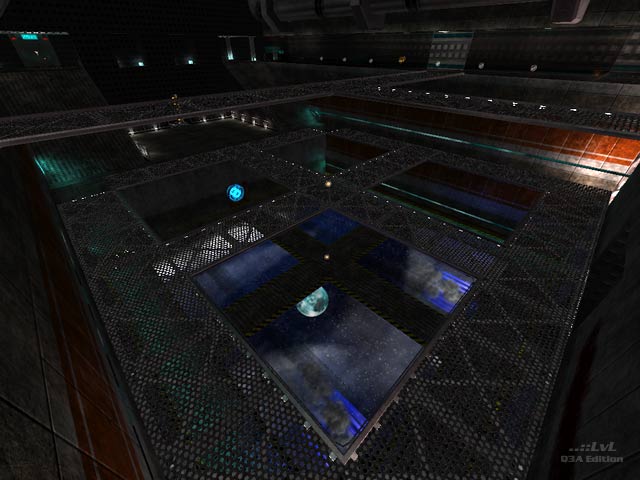
Set on a very dark space ship with no consideration for game play. The focus of the level appears to have been with artistic direction above and before anything else. This has lead to a level that plays terribly. The biggest problem is the ship is too dark and open with sparse weapon placement. You stumble upon your opponents or wait for their weapon flash to locate them. A number of passages will be discovered by accident simply because the entrances are hidden in shadow.
The bots appear to play the level without any real issues, but will you? Remember, the bots can see in the dark. While a lot of effort has gone into the aesthetic, including custom environment shaders and user interface numbers which take advantage of the remap shader option, a better approach would have been to start with a game rich blank level and apply the visuals later. The layout and aesthetic focus has also lead to very large r_speeds, which translates to lower frame rate.
This a large download that demonstrates why game play should be put first and visuals second.
Tigs notes: A second version is available that includes a sound track. (~about 39MB)
Ranked: 4.4 out of 5 (22 votes)
Download: Passing Uranus by Wakey
