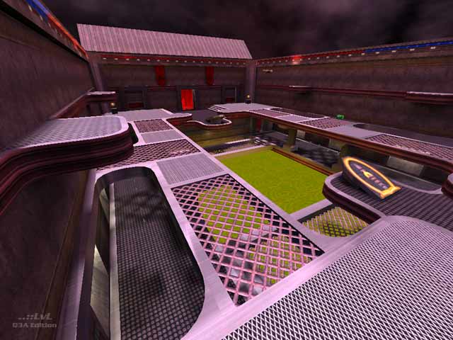
This map suffers from two main drawbacks: firstly, the VIS blocking is minimal, resulting in seriously depressed framerates in spite of the relatively detail-free architecture. There are around 20 doors in the map, but only two (leading into the central courtyard from each base) are areaportalled. The author should have remembered that patches don't block VIS.
The second main problem is the texturing: it is truly ugly. Team colours are plastered everywhere with no aesthetic sense at all, interspersed with gunmetal greys, giving the map a curiously Doom II-like appearance. The door textures are especially awful, consisting of a base wall texture with the word Quake!!! written on it.
Gameplay is confusing and incoherent; the narrow, blocky corridors that infest the map are laid down seemingly with no logic whatsoever, and in spite of the multiple paths through the base areas the bot-play is repetitive and fairly unchallenging. There is a large slime pool in the central courtyard, for no apparent reason. Lighting is bland, and the use of one of Cardigan's excellent dynamic skies and a thunder sound effect doesn't really compliment the environment at all. The exploding crates, while ingenious, are just unnecessary gimmickry in a Q3A level.
I really have tried hard - honest! - to find something positive to say about this map, but I just can not think of anything at all. It isn't quite Cranky Steve material, but it's close. Download only if you want an illustration of how not to make a Q3A CTF level.
Reviewed by seremtan
Ranked: 2.1 out of 5 (9 votes)
Download: Freak's Fortress by johnboy
