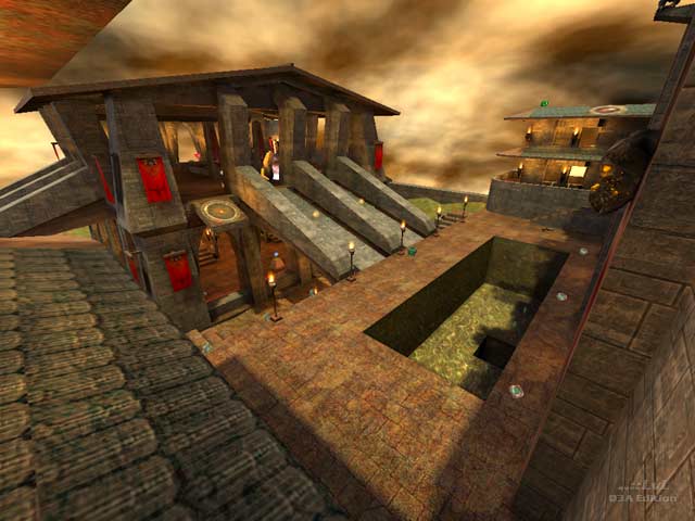
Everything you eventually learn not to do in a map is here for the taking. From garish lighting to overuse of torch models, lava and flames everywhere, paper thin walls, clan and website advertisements, etc ad infinitum. The basic idea is that there are some big Gothic structures in a hilly grassy area, connected by tunnels underground and bounce pads above ground. This is about where it falls apart. The texturing and brushwork are haphazard few of the buildings are built right against the skybox. There are ridiculously narrow stairs, cramped towers housing spiral staircases that are difficult and irritating to navigate, and more. Item placement is not much better than the brushwork. Bots don't even know which way is up. The FPS is decent considering just about all of the map is always visible. One area that was nicely built was the subterranean Quad lair, which was neat looking and made it suitably difficult (though not overly so) to get the Quad. 187-J4CK4L should look closely at some of the iD maps and pay close attention to things like trims, vis blocking, and basic structure for some inspiration.
Avoid it unless you are desperately trying to find a huge TDM map for a RA3 LAN and don't care what it looks like.
Reviewed by Havoc.
Ranked: 3.5 out of 5 (5 votes)
Download: Castle of LANaholics by 187-J4CK4L
