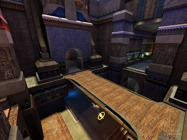
Some serious work has been put into this map, and it shows. Stylistically speaking, it's faintly reminiscent of id's Gothic maps but cleaner and less brown. Textures are mostly id originals, though there are some modifications, including Threewave banners, some new shaders and a bright, sickly animated sky. The layout is extremely elaborate and complex. Consisting of narrow, winding passages that criss-cross each other in unusual ways that make for interesting vertical as well as horizontal game play. Sometimes converging on a courtyard (where there is usually a power-up), other times opening on to each other via bridges, windows, broken-up floors and bouncepads. Some direction markings would have been helpful. The architecture is detailed without being too visually 'noisy' - though it could have used more clipping, especially around the flag base bouncepads. In fact the shortage of clipping and the lack of any environmental sound effects are the only criticisms I can make of this top-class piece of map design.
Bot play is nothing special. The narrow passages combined with their bizarre habit of bunching up make them a soft target for the RL, handily positioned on a cloister above the flag. Still, they played OK and I didn't see any of them fall into the fog of death that lurks just below some of the broken floors, so that's something.
Download this map now!
Reviewed by seremtan
Ranked: 3.6 out of 5 (10 votes)
Download: Wrong Again by Eggman
