Added 27 Jan, 2003
Comments
Add a comment
**Preview only**
Be sure to submit your comment
Be sure to submit your comment
Submitting comment...
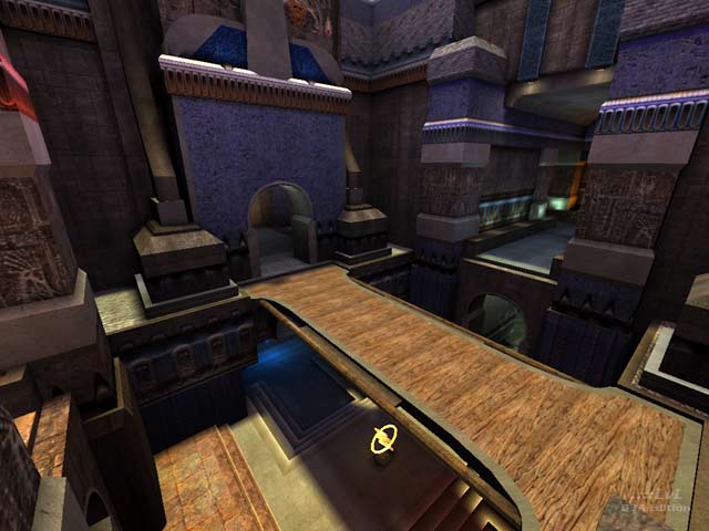
I agree with the comments on the lighting in places (too dark) and the length and narrowness of some passages (could be broken up). I live for this kind of complexity in a large ctf map, so I found that no bother, but the suggestion of direction markers was a good one. The two things that bothered me the most were 1. no armour close enough to the flag rooms for defensive purposes, and 2. the number and frequency of trip hazards impeding smooth movement between the bases. These 2 elements get really frustrating really quickly and put a damper on what otherwise could have been a real treat to play on. Nevertheless it looks great and plays pretty well too.
Agree (1) or Disagree (0)
nitin: I hear what you're saying but on a comparative scale (i.e. compared with some of id's terrible DM maps) it's not that noisy.
Agree (0) or Disagree (0)
I agree with nitin on some points, i think the map is overly complex in areas, also, there is a bit of tightness in some areas as well. Another nitpick is the long halls in both bases that are directly opposite each other - you can see across 75% of the map looking down this hall. This would be a tough one for 4v4 matches, but potentially very fun on pubs.
However, i think the layout -although complex - is very interesting and makes for interesting combat situations. The brushwork and architecture are great, as is the texturing. Well put together map, very well polished. 8/10
Agree (1) or Disagree (0)
I noticed the links here and at PQ in general fade in and out of functionality, they should work after a couple of clicks though.
You could also try the link from my site.
<a href="www.fileplanet.com/dl.aspx" Target="_BLANK">www.fileplanet.com</a>
Agree (0) or Disagree (0)
krekits: If I worked continuously on this map the dev time would of probably been 2 months. 1 month of actual building, 1 month of revising, rebuilding, retexturing, etc... However there were very long portions of time that I didn't work on the map at all. PJW helped out alot with squashing some bugs that I simply couldn't track down, so big props go out to him as well.
Agree (0) or Disagree (0)
Holy shit, I remember playing this ages ago! How long did it take to finish it?
Good job!
Agree (0) or Disagree (0)
I'm glad to see this monster released already. :) Nice job!
Agree (0) or Disagree (0)
eggman already knows my opinion but I disagree with the reviewer and do think it's too noisy visually. The brushwork's actually pretty good, but the texturing could have done with more polishing and in some areas the lighting doesnt help.
Layout wise, it's a newbie nightmare and even once you learn it, it still feels a bit overcomplicated.
Shows talent, but you can sort of tell the eggman was kind of sick of working on it.
6/10
Agree (1) or Disagree (0)
thx peeps! yeah I guess I took my time with this release, I just didn't want to kick it out the door until it was polished. btw great to hear that threewave is now officially a game company.
Agree (0) or Disagree (0)
Wow. I remember beta-testing this map for the last threewave release. The amount of detail is amazing, it was fun to play as well once we learned the slightly complex layout. The only bad points is that several areas of the map is very small/tight, but this may actually be good in avoiding excessive rail play. Awesome map otherwise! 9/10
Agree (0) or Disagree (0)
