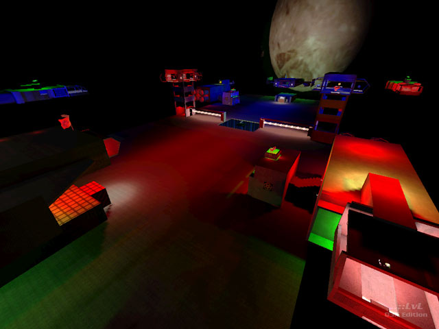
Pretty much a by the numbers guide to how not to make and distribute a map. It's a bunch of boxy spaceship things attached to a massive rectangular platform with over-saturated coloured lighting, several missing textures, overlapping faces and bland construction. It's also incredibly dark. The sky is actually constructed from textures applied to separate brushes rather than using an environment skybox (apparently the map's author tried and failed to get one working because there are three identical sets of unused skybox textures stored in different paths within the pk3). Some tiny abandoned brushes are suspended in the air. Curves don't match up to their surrounding caps - it's not LOD cracking, they just haven't been made to fit. In addition to the previously mentioned unused textures the pk3 includes some of the mapper's folder settings and a folder background image! Also custom sounds have been dumped into the sound/world folder rather than a sound/world/[mapname] folder as sensible practice would dictate. The readme appears to be from SpaceArena 4.
I'll admit that the time spent playing this was only a few minutes but still feel confident in saying that it has zero game play. Look, there are two BFGs in this map. There are triggers that spam plasma onto areas where members of your own team could easily be, and there are spawn-points on top of these triggers. There are jumppads below tubes narrow enough to hit your head on a couple of times before making it up. There is no nodrop brush in the base of the skybox. Navigating between two areas often involves button-operated lifts. Actually getting to the flag requires a ridiculous amount of messing about. I couldn't face loading it again to test with bots - it makes my eyes and my mind hurt to play this map - but I could see exactly where the bots were going to get stuck and can confidently say that they will be completely and utterly unable to play the map.
The author really needs to study proper construction and actually look at what makes good maps work before they stand the tiniest chance of making something that is approaching being a worthwhile release. I've tried but I really can't think of anything positive to say about this. This is the mapping equivalent of a three-year-old's finger painting, and like the other maps from this author it belongs on Cranky Steve's not ..::LvL.
Reviewed by Shallow[BAP]
Ranked: 2.4 out of 5 (20 votes)
Download: SpaceArena 3 by Deek
