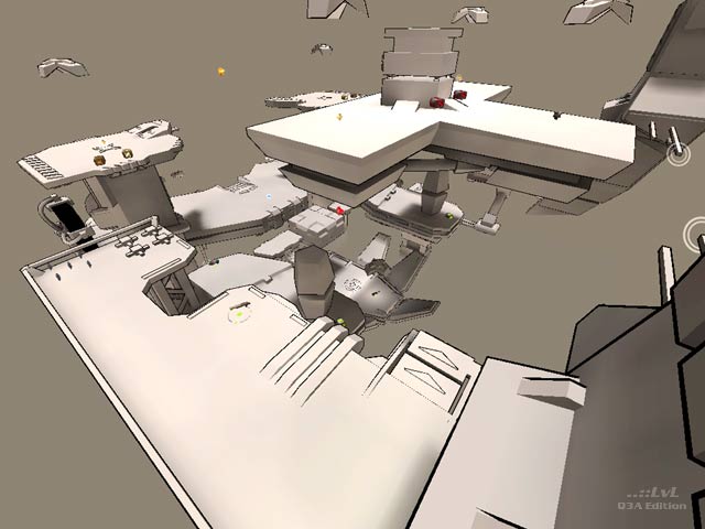
As the author explains, this map was "not built as a really playable map but as a design study". This is a light-grey floater in a light-grey space. The map looks like a cartoon drawing, which is interesting for some minutes, and remembers to Charon's geocomp2 entry. For being a floater, it offers some complexity with lots of bounce pads and platforms. The item placement has its nitpicks, like the MegaHealth, too close to the red armour, focusing too much the game play on the center. Bots play with some problems, dropping too much on that central area to get the best items.
A nice design study. Download it if you are a diehard floater fragger.
*papri-K*
Tigs Notes: Its great to see people trying new styles and this 'cell shading' aesthetic is very cool. Great work!
Ranked: 4 out of 5 (31 votes)
Download: lichtwärts by -cha0s-
