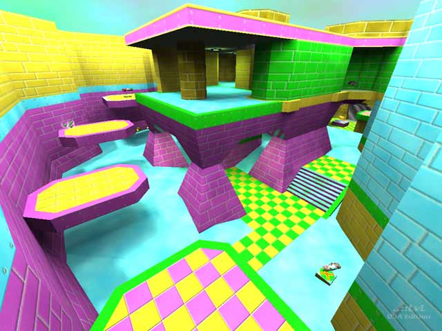
Without a doubt the map title says it all. Be prepared to get fragged as you spend your first few seconds looking around in slack mouthed horror at the eye-searing textures. The artist was going for a concept here and has grossly succeeded. It's like all the demolished tiled kitchens and bathrooms of the 50's and 60's unquiet spirits have come to rest in this map. Neon pastels assault the eye and the only escape is to look into the swirling grey black teleporter. If the mappers goal was to shock and stun the player with riot of nastily clashing colors. Mission accomplished. This map is just plain ugly. For a comparison of the mappers work, check out mvdm01 a small space map that has stayed on my hard drive for a long time.
While being ugly, the map is well put together. The jump pads are nice looking and game flow is great. The multilevel castle like structure is fun to move around in and provides some good firefights. The jumping platforms are useful, and easy to use, and most of the map begs to for a rocket jump. Items and weapons are well placed but a little to heavy for my tastes. One major fault was the inclusion of the Quad and a BFG on this map. It is just to small for that much firepower. Bots navigate the whole level with good pathing, and low frame rates make this a map for every system.
Download, and Shudder!
Reviewed by Meatboy Dogfood
Ranked: 3.2 out of 5 (14 votes)
Download: Pure Ugly by Munyul Verminard
