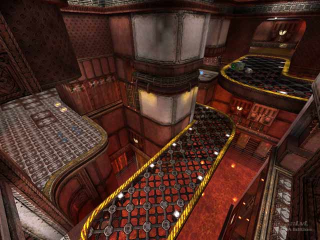
For this particular portion of the competition, level designers were expected to work with a particular layout and to design the visuals without affecting the game play. Included are 4 versions of the map, including the "base" map which uses one texture. "Red Ribbon" is arguably the best result as it features a good theme and has relatively good lighting throughout. The game play itself is okay, but the item placement is fairly suspect. The Red Armor and MegaHealth are very close. The Rocket Launcher, Rail Gun, and 4 of the +25 health balls are all placed in the immediate vicinity.
Go ahead and take a peek if you are interested. Most gamers won't care to play the maps, but the game play was not in the hands of the competitors.
Reviewed by Pure Imaginary
Ranked: 3.4 out of 5 (7 votes)
