Up & Down
by uoz
Up & Down by uoz
Comments
Add a comment
avatar
**Preview only**
Be sure to submit your comment
Formatting help
Submit
Preview
Cancel
Submitting comment...
Octovus unregistered
#11   27 Jul 2001
Interesting comment about the lightning gun Sanjuro, no there isn't one in this map (you can watch the loading screen and you will see no lightning bolt icons load, that basically tells you there's none in the map).

This map is certainly something different. It once again felt a bit like singleplayer (as in one person, all these monsters, not as in bots :-p). The higher you went, the harder time you had living. Way up top your little railgun was your only defense. In the middle fierce battles for the rocketlauncer took place. Down below was fairly quiet, because of the spread out nature of the layout down there. Ok, so I left out the armor shards/plasma gun ammo level. Not like anyone really went there anyways :-)

The base/goth theme was...ok. It worked fairly well, but really I think this map could have done fine just as a base map. With all the bounce pads, sharp angles, and many levels, it is not something you would naturally think of as a goth environment. After playing this map for a while, the textures started to give me a headache (and no it wasn't from sitting in front of a computer for very long, I was only in it a half hour).

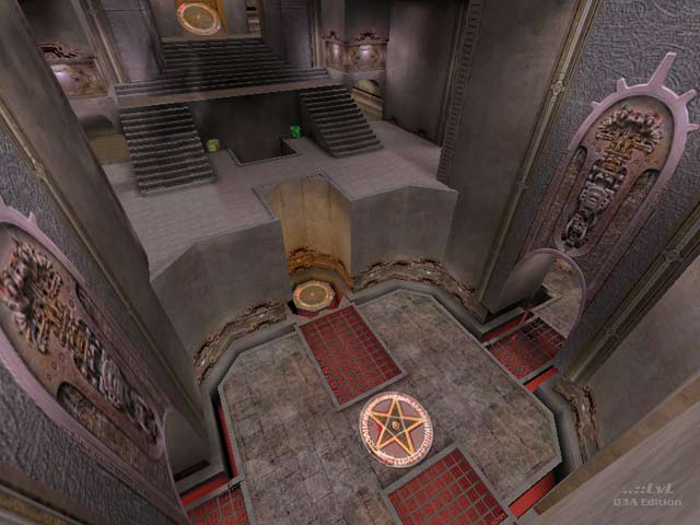
The little spawn point in the screenshot above (or what looks like a spawn point) was as a trick, right? I never saw anything there at any rate.

Pretty damn good, the looks may be a little iffy, but it's big and it works; an 8 from me ;-)

-Octovus

Agree (0) or Disagree (0)
Sanjuro unregistered
#10   24 Jul 2001
One of the better custom maps Ive seen. Thanks for not putting a lightning gun in it! (or I havent found it yet hehe)
Agree (0) or Disagree (0)
hth unregistered
#9   24 Jul 2001
Very nice. Liked most things about it. The lack of custom textures and complete symmetry of the map are the major things I have against it. (8)
Agree (0) or Disagree (0)
not Nicholas unregistered
#8   24 Jul 2001
I like it except for the shiny surface on the ceilings of the low hallways. It's distracting to me and seems outta place. The higher ceilings are non shiny/gloss and look better I think. But it's fun to play and is a keeper.
Agree (0) or Disagree (0)
StormShadow unregistered
#7   23 Jul 2001
Looks fantastic, but i really didnt have much fun playing it. Reminds me of q3dm10 (which is not a good think :P )

Gave it a 7..

Agree (0) or Disagree (0)
Featured Ripper unregistered
#6   23 Jul 2001
Nice work! Question: Ever consider swapping the SG and the RG, therby making the would-be camper work for their position up high?
Agree (0) or Disagree (0)
Xplain unregistered
#5   23 Jul 2001
Well never played Custom Maps before. Perhaps 1 or 2. But now i have DSL and going to load them all. They really rock! Never knew what I'm missing! :)
Agree (0) or Disagree (0)
mommentum unregistered
#4   23 Jul 2001
Cute hidden jump pads.

Just looking at those openings gave me the idea of putting the pads there.. and - voila.

Excellent.

Agree (0) or Disagree (0)
Interceptor unregistered
#3   23 Jul 2001
Yes, very good gameplay with room for quite a number of players, definitely worth checking out!

Interceptor

Agree (0) or Disagree (0)
Choco unregistered
#2   22 Jul 2001
Usually, I dl maps like this, but rarely play them, but this masterpiece is an exception! Big ol 10 from me!
Agree (0) or Disagree (0)
The Loader unregistered
#1   22 Jul 2001
This map was directly send from the high heavens ! Great release; I love it:

a 10 from me :)

Agree (0) or Disagree (0)
Clear