Added 30 Dec, 1999
Comments
Add a comment
**Preview only**
Be sure to submit your comment
Be sure to submit your comment
Submitting comment...
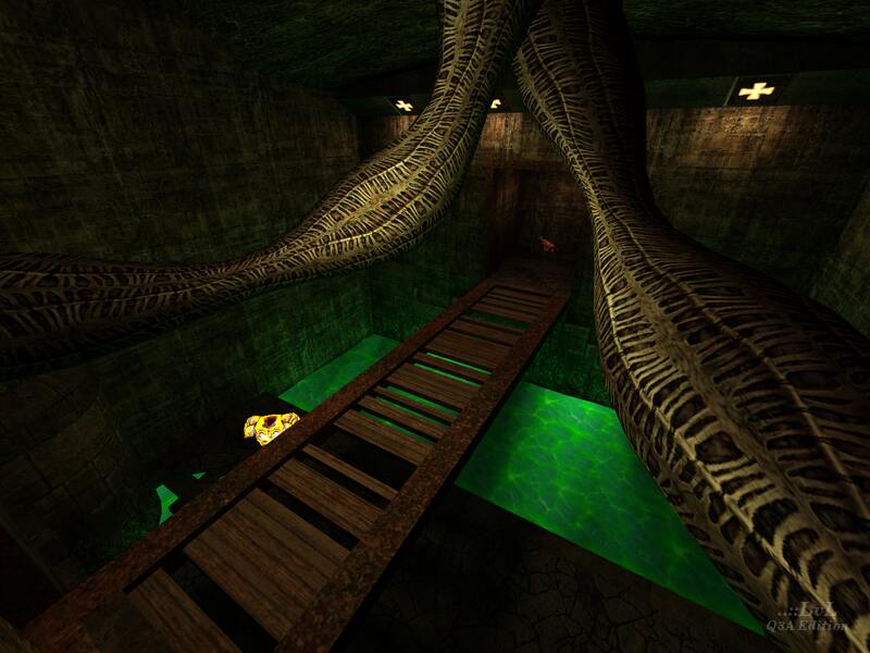
It's a Retro map and it never gets old :). I love the effect of the slime it really does give it a poison look. I loved the Environment since it was supposed to be dark & mysterious which I felt during Gameplay. Nice piece of work Tom!. 8/10.
Agree (0) or Disagree (0)
A few years back, I remember playing a game with someone with the username; "TheEvilOne". Made me think of that player....
And yeah, the map has some cool features, but the brightness needs to be adjusted. REALLY. 6/10
Agree (0) or Disagree (0)
This was one of the first maps I downloaded here at Lvl! Ah, good times.
Agree (0) or Disagree (0)
Check the F.A.Q. section, from the top left of the site, try:
Site -> F.A.Q. -> How to play a map
Site -> F.A.Q. -> How to play a map
From memory, this map is will need to be started from the console with:
\map Evil1
Agree (0) or Disagree (0)
gr8 map...very diferent from the maps ID made
Agree (0) or Disagree (0)
Beautiful for sightseeing AND fraggin'.
Agree (0) or Disagree (0)
a bit dark but good. (dark realy isn't a big problem, i'd get tired if all maps were bright and shiny)
Agree (0) or Disagree (0)
love the green "goo" pits
Not enough maps have these, hint hint.
Bit dark but nicely done
Agree (0) or Disagree (0)
love the green "goo" pits
Not enough maps have these, hint hint.
Bit dark but nicely done
Agree (0) or Disagree (0)
The map is really a little bit dark, but it make fun when you play it longer.
The map is a good map :]
Agree (0) or Disagree (0)
The layout some what sucks, and those thin hallways don't help much. Graphically, the organic stuff looks cool, although I did see some ripping. Its much to dark though, and the rail gun should of been replaced with some type of power up. I don't think that many people will go all the way for it. Its still an intersting map.
Agree (0) or Disagree (0)
Way too dark (much darker than the id maps).
Agree (0) or Disagree (0)
not large BUT:
A really well designed map
very free to breath in
very slow and fine designed.
The Athour has to be a cool guy ;).
See ya !
Agree (0) or Disagree (0)
This map looks pretty cool graphically (if a bit dark, which is still cool). It took me a minute or two longer to memorize than most maps, but once I knew my way around, I found it to be a very cool map.
This map has lava, this map has slime, this map has the moving organic stuff, this map has those pits you can fall into, this map looks cool, and this map should be on your hard drive :)
Agree (0) or Disagree (0)
