Be sure to submit your comment
The RRROOOAAARRR verdict: 9/10
gj again Mr. Clean!
Runs very clean ... ;)
@Khaile: You can write me a mail, I'll tell you then. mailto://q-fraggel@creutzenberg.de
But that's not the point. Bots eat into processing time and so slow the map down. It's thoughtful of Mr.Clean to give us lonely old souls bots to play on our obsolescent junk, but the hope is that this map is going to be played by humans in competition using top-end machines over a LAN. So the opinions on framerates that matter are those gathered in such circumstances.
Khaile - so can I take what you say as an admission that I'm right? (Loved cpm4, by the way - just a pity about the teleporters ;P)
Q-Fraggel: do you hang out somewhere at IRC?
Tigger-oN: The url to CPM should be www.promode.org ;)
Dagwit: Who cares that much about teleporters? lol ;P
Mr. Clean: Amazing r_speeds for this map. I find it too big even for 8 players, anyway :(
My only thoughts on this map were that it was unplayable. I loaded up a TDM game with bots and it just chugged. Hard. This is the only map ive seen do this, even ta maps run better. Freaky...
Rather than nursing my wound in silence I intend to push the brazen stump out a little further and speculate on why Mr.Clean, who used custom teleporters in his last two maps, opted for the standard iD item here (except in one place), and on why it works so well.
As to why he used it: I know there's a great determination to get this map widely accepted, and so I'm guessing that Mr.Clean decided, or his collaborators on Team Abuse advised him, that to oblige players to recognise a strange teleporter design while struggling with a large and unfamiliar map would be to put an avoidable hurdle in the path of that acceptance.
As to why it works so well, we have to look at the design of the iD teleporter, its use by iD in techno maps, and its use here.
I think that iD optimised the design of the iD teleporter - a naturally 'techno' object - so that it would not look out of place in gothic maps. The dull pewter texturing, the arching of the arms, the rigorously neutral design of the teleporter effect all help this. The 'machine' detailing on the arm texture actually blends in at any distance with gothic detailing (you can see this effect on q3dm4), while even the design of the 'here I am' sidelights echoes that of the small gothic lamp iD uses (they appear frequently together in third-party maps though not, as I recall, in any of the teleportered iD maps).
But having gothicised the teleporter so successfully iD now faced the problem of how to stop it looking out of place in techno maps. To see how they did this, look at the three techno maps q3dm10, q3dm11, and q3dm12. Notice how, in q3dm11 and q3dm12, many of the doors and passageways lean out at the bottom for a short way, then lean back in the rest of the way up, imitating the outline of the teleporter and thus unifying its design with the rest of the map. And while the square shape of the metal pipes next to the teleporter in the FoD room in q3dm12 do nothing to help, their textures do look similar enough in the FoD glow to contribute to the unifying effect.
Now look at q3dm10. No teleporter - and no design elements which lean out at the bottom and in the rest of the way up. No need to unify the design with a teleporter that isn't there. (The teleporter-friendly door design is used in q3tourney4, but there are no other teleporter-friendly elements, and I'm guessing that the door was re-used to provide unity of design with the preceding q3dm12).
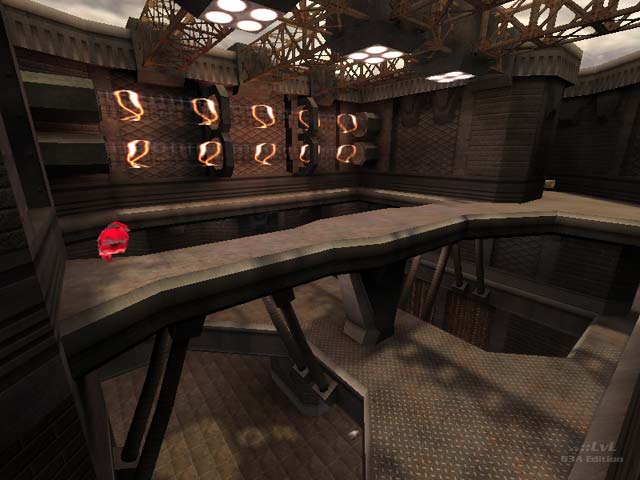
So has Mr.Clean done anything in 'Abusive Intentions'to unify his design with the teleporters? Well, have a look. Do you see colours that blend well with the dull pewter of the teleporters? Do you see any design elements that lean out at the bottom for a short way, then lean back in the rest of the way up? Having been obliged to consider the question, it seems obvious to me that this map has in many details been designed around the iD teleporters. Yet, such is Mr.Clean's genius, if I hadn't asked myself why he'd chosen to use those teleporters, I would never have suspected the source of the inspiration behind such clever design.
When I'm wrong, I admit it, and my original statement was clearly wrong. I now recant, and replace it with: 'No-one aiming at a consistent aesthetic should be using iD's teleporter in techno maps unless they are willing to devote substantial design resources to harmonising the rest of the map with it.'
The level seems a little dark for me I just turn up bright ness a little.
It take a bit of time to get a hang of the map but once you do its a blast (goota love that water area)
We need more teamplayer maps of this quality. Go now and download.....
Great layout and really moody (a little bit too much for some). The underwater section is amazing :)
