Be sure to submit your comment
Makes you want to keep the bloody frags flyin'.
I had a look for a tutorial which would give me some clue as to how he pulled this off, but didn't find one (if anyone knows of such a tutorial I'm sure that neither Charon nor Tigger-oN and Mandog would begrudge the space needed to post the URL). So I've had to try to figure out for myself how he achieved such a triumph.
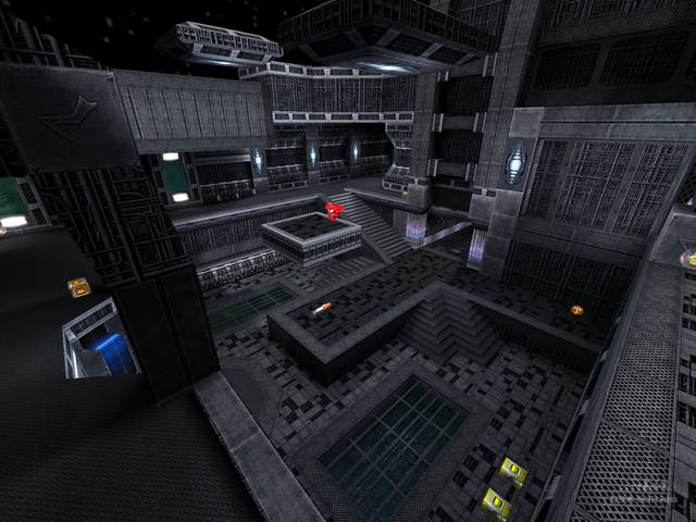
One reason why drawn 3D detail goes flat is the existence of high contrast in the texture. High contrast implies light and shade, shading is perceived as shadow which in turn implies a definite direction for the light falling on the texture; and if the light in the map is not coming from the same definite direction the eye ceases to be fooled and starts reading the texture as a photograph - the most common case we encounter where the depicted light direction differs from the actual. Now the textures in this map mostly range from grey to black, limiting the range of perceived contrast (except in one or two places using the 'band of skull-mask' texture), and therefore the risk of lighting contradictions arising.
This risk is further reduced by ensuring that light comes from all directions in the map - ceilings, walls, and floors. If you were wondering why there were so many lights spread about this map, my guess is it's to avoid any one source 'contradicting' the textures.
Lastly, the widespread use of pulsing lights and other shader effects (and even moving platforms) disturbs the eye, discouraging it from resting too long in one place and so stumbling over any inconsistencies.
Well, almost lastly - even the custom bots, grey and difficult to pick out against the map, contribute to making it dangerous to spend long enough staring at a texture for it to 'go flat'. But even without bots on a walkthrough, the illusion is pretty well sustained; though all 3D textures will go flat if you look at them hard enough. There are limits to what can be achieved; but Charon has stolen cunningly close to those limits.
(One technique not I haven't mentioned is that of distancing the player from 3D textures by keeping those textures in alcoves and other recesses where it is impossible to get side-on to them; but on the whole Charon is happy to rely on the techniques described above, and allows the player to get right up to many areas of 3D texturing.)
On a different note, I thought the tunnel portals were excellent: ideally I'd like to have seen the rocking removed and the portals linked directly to get as close as possible to a continuous tunnel, and I suspect this was the original intention, but the tendency of the bots to ping-pong on linked teleporters probably changed Charon's mind.
Problems? The only flaws I noticed were that the pipework texturing on adjacent faces would sometimes not line up, and in one or two places its edges lacked trim; but I'm sure that these modest failings constitute a deliberate ploy to prevent the Gods accusing Charon of hubris!
An excellent map. What could have so easily have been an example of too much fussy and unconvincing detail has emerged instead as a tour de force.
Great work with the textures and architecture.
I found that in standard Q3 bot play camping by the rocket amno and health above the jumppad looking down at the yellow armour was a great spot for picking off the bots.
Anyway grab this map you should like it I know I do....
I prefer the look of the map in vertex mode cause I think the color of the moving shaders doesn't really fit the rest of the level.
(It was already said, the tunnels to the portals are too long)
Another minor issue is that you hit the top clip brush in the main rooms when you try to do a rocketjump.
The architecture is really nice with a "deathstar" atmosphere.
Overall, good work! I like it.
