Added 20 Jan, 2001
Comments
Add a comment
**Preview only**
Be sure to submit your comment
Be sure to submit your comment
Submitting comment...
i like the map, a bit more that senn's ... it's great... you have skillz JUZ aka. FEAR NO EVIL =) yeah good old CQA juz... anyway those pumping things in the PG room, should squeez you to death, but they don't, there's also an error above the RL at that sky window
Agree (0) or Disagree (0)
Top stuff Juz, considering this is only your third attempt at a map you certainly have the nack!
An 8 from me :)
Agree (0) or Disagree (0)
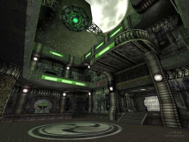
I enjoyed Senn´s Mindfields, so I enjoyed this one too! Very Giger-ish "Alien" athmosphere. Here are also some cool new details like the wall teleporters.
Agree (0) or Disagree (0)
yup, forgot to mention lack of ambient sounds--Charon's right. In a unique theme map like this, appropriate ambient sounds make and even greater impact. Anyway, good luck Juz.
Agree (0) or Disagree (0)
I rarely say anything about anyone else's maps...but this one I felt I should.....this is a rather enjoyable piece with a unique feel.......it is definately worth a look....it reminds me a lot of the old quake1 style maps......I think adding a few very moody ambient sounds would have added some deep atmosphere into this map......the layout and connectivity is ok...but it needs a little more.......I found myself almost always in the rocketlauncher room or at the red armor...rarely if ever making it to the plasmagun....overall though...its a good play....nice work and I look forward to playing your future maps
Agree (0) or Disagree (0)
Pretty enjoyable, at least for awhile. I'd like to see an even larger map using this texture set. Couple of points: (1) the amount of health is OK, but I'd remove some of it from the RL room and stick it in the PG room--given the overall design of the map, there is not a lot of motivation to go into the PG room, use a little health as a hook. (2) The lighting is a bit dull (emphasize a "bit")--some shader work on the green ceiling tube(s) in the hallways would add more atmosphere. More 'active lighting' if you will. (3) I'd like this map more, gameflow wise, if there were no deadends in the hallways--little hallway alcoves almost never help a map's gameplay value--unless they can act as camping hideouts on map where, strategically, this makes sense. This map is way too open for that. All in all, I appreciate the effort that went into this map, and I hope Juz keeps on truckin. I certainly look forward to yer next map bud.
Agree (0) or Disagree (0)
