**Preview only**
Be sure to submit your comment
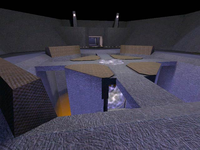
Ahh brings me back to my UT99 days. The textures look exactly like the ones in UT99. Just goes to show that some mappers tend to make maps with no effort
Edited: 02 Jun 2012 AEST
Agree (0) or Disagree (0)
not entered
unregistered
#11 26 Dec 2001
Special map, and yeah it's original. (not one of those "one of many gothic styled" thingsz out there)
Agree (0) or Disagree (0)
not entered
unregistered
#10 26 Dec 2001
Special map, and yeah it's original. (not one of those "one of many gothic styled" thingsz out there)
Agree (0) or Disagree (0)
Steinecke
unregistered
#9 07 Apr 2000
Something special. a goodie!
Agree (0) or Disagree (0)
Scorpion
unregistered
#8 13 Feb 2000
This map has some flaws it's to big we are missing the railgun but one thing is very good the surroundings 7
Agree (0) or Disagree (0)
pjw
unregistered
#7 07 Feb 2000
Very different and pretty map. I like it quite a bit, and it will stay on my harddrive for quite a while :-)
Played for about an hour last night, and I think a railgun would make this map pretty easy to dominate, but I would like to see the entire map at about 50% scale. This IMH would speed up gameplay and raise the fun factor . . .
Agree (0) or Disagree (0)
Postmodern
unregistered
#6 07 Feb 2000
Well, guys I just wanna say thanks for the praise ... If anyone wants this map smaller or with a rail, (or anything), they can always contact me). URL is in the readme.
Agree (0) or Disagree (0)
Rokscott
unregistered
#5 06 Feb 2000
In response to Belial's post.
I find that a lot of the Id maps make it hard to see your opponant at medium to long distance.
Drab backgrounds make it easier to pick out your enemy.
I can see the favored maps of hardcore players (not mappers)in future being a bit on the bland side.
Agree (0) or Disagree (0)
Belial
unregistered
#4 06 Feb 2000
Played this last night completely wasted. Turned the fov up to 120. Puked. Came back and played for an hour.
sorry for sharing that.
I like the layout and water areas, but the color gets a little drab after a while.
Agree (0) or Disagree (0)
AssBall
unregistered
#3 06 Feb 2000
I like the design of this map, though I feel it could have more complexity. The vertical water surfaces were just plain cool, and the feel of the level is nice.
I was left wondering, however, where be the rail gun? It takes like 5 seconds to shoot a rocket accross the level. It almost seems like this is more of an artistic approach to map making, and turning it into a useable DM was an afterthought.
Agree (0) or Disagree (0)
Rokscott
unregistered
#2 06 Feb 2000
I managed to grab this from fileplanet on my first attempt...Hoorah !
Interesting and original map IMO.
Lighting seems just about right (atmospheric without being too dark).
My major gripe is that the map is just too big. I think scaling it down a bit would make for better gameplay.
6 outa 10.
Agree (0) or Disagree (0)
d3f3nd3r
unregistered
#1 06 Feb 2000
Actually, I think this map will be on my hard drive for a while.. haven't had a chance to play it against humans yet but I think the water pits could make it interesting (maybe too easy to dominate?) ... good map tho. Layout is a bit confusing and could have used a railgun in the open arena part, but other than that it is very well designed.
Agree (0) or Disagree (0)

