Be sure to submit your comment
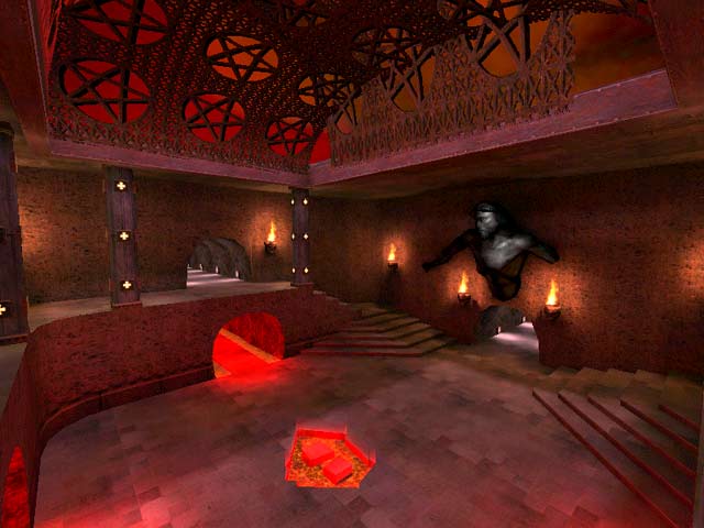
The whole map is pretty dark, with large areas of rooms covered in complete shadow. The lava beam shaders overtop of the copious lava are not aligned properly and some have gaps at the corners. Some of the texture selections are questionable and become dull; the presence of a mirror on the ceiling of one hallway serves no purpose. There are no ambient sounds in the map, which really makes it lack atmosphere.
Game flow is not improved by the many teleporters thrown around the map. The overall layout is that of a number of boxes connected by hallways and the first lifts I've seen so far in a Q3 map. Overall, the architecture and item placement doesn't focus play on specific regions of the map, leaving you to wander around until you find somebody to shoot at.
It looks like the author has a good command of the editor, but needs to pay attention to things like lighting, texture selection and item placement.
