**Preview only**
Be sure to submit your comment
druzli
unregistered
#22 07 Aug 2000
vibrator:Then what do you call q3tourney4:)
Agree (1) or Disagree (0)
Vibrator
unregistered
#21 04 Aug 2000
This map is too simple! It is boring after a few matches.
Agree (0) or Disagree (0)
Ísak
unregistered
#20 04 Aug 2000
Good one ;)
Agree (0) or Disagree (0)
Styx
unregistered
#19 28 Jul 2000
We blijven toch wel gewoon engels spreken he ?
Agree (0) or Disagree (0)
Dusty
unregistered
#18 21 Jul 2000
this map is brillliant Druzli...it is my kinda map in every ways....good luck in the near future mapmaking and youre doing a good job made
Agree (0) or Disagree (0)
Dusty
unregistered
#17 21 Jul 2000
this map is brilliant in every way....this is my kinda style in mapmaking and i love playing it in every way....nice work Druzli and good luck in future mapmaking made
Agree (0) or Disagree (0)
not entered
unregistered
#16 21 Jul 2000
If you've read the readme file
then yoll see I'm one of the guys who tried the map out through it's whole development
and i must say I LIKE IT A LOT (thought DruZli is directly beneath me and hax0ring me to comment on the map, he has no power over me what so ever, ((I can whoop his ass pink every time in Q3A :) )). So just download it and try it out I guarantee you'll like it.
Retro
Agree (0) or Disagree (0)
RedFive
unregistered
#15 21 Jul 2000
Si y fallait que tout le monde parle sa propre langue, Christ que ca serait laid !!! En passant, la map est pas pire mais j'suis un peu tanne du Gothique !!!
I said I'm tired of Gothic in there. Figure out the rest !!! >:)
Agree (0) or Disagree (0)
MONSTRO!
unregistered
#14 20 Jul 2000
One thing's for sure:
This aint Spanish!
Agree (0) or Disagree (0)
Uncas
unregistered
#13 19 Jul 2000
Sumt people kann just ekki manners!
Að post á some fáránlegu language er just heimskulegt to segja the minnst :)
Agree (0) or Disagree (0)
druzli
unregistered
#12 19 Jul 2000
I have to say that,I have no idea what he says down there:)
And i,m from iceland and my language is strange:)Here it goes:Halló allir þarna úti takk fyrir að skoða kortið mitt.
Agree (0) or Disagree (0)
Zarathustra
unregistered
#11 19 Jul 2000
You got that druzli? I think Serendipity likes it. ;)
Agree (0) or Disagree (0)
Serendipity
unregistered
#10 19 Jul 2000
Haomé,
Hâ kanoon connectivi inè màp. Doo iki labta inè màp, nè dagué labta kez Yo wanat.
Zae's maré kanoon wa; maré né iki négta bots iné Yor màp.
Maé gaéat Yor kiakii màp; guita màp dolotaï né iki disk.
Dano 8
Barr hâ meenaï sem okk textué héko; Yo takta dissem textué dano 9
Moté lepta maé, kaza!
Séyat Yo afar, hokaza fo sankaar.
Mayamé.
Sankra.
Agree (0) or Disagree (0)
MEet-CEes
unregistered
#9 18 Jul 2000
i have a Leaked Beta.
Oops.
dont tell DruZli i said that.
wouldnt Wanna Get Kicked.
Youll Have to Wait.
Its Extra DruZli-aTed!
[Hey lets Talk Druzli into A CTF version of BULLsH1T]
Agree (0) or Disagree (0)
Uncas
unregistered
#8 17 Jul 2000
Sweet... As always :)
Can't wait to see yer brand knew creation in flying colours soon.
Agree (0) or Disagree (0)
zodiac
unregistered
#7 17 Jul 2000
Of course a great map, as is every map druzli makes... send more maps man! world domination is only a step away. Good gameplay and item placement, a very playable map.
Agree (0) or Disagree (0)
Niptlar
unregistered
#6 17 Jul 2000
The gameplay is actually good, and the item placement is actually discliplined. I don't care for the Railgun dead-end, but all in all, I can dig it okay. A little big for tourney, though.
Okay, can we play levels with a different weapon selection now?
Agree (0) or Disagree (0)
MONSTRO!
unregistered
#5 17 Jul 2000
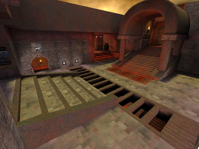
Like the aesthetics and the lighting - havent played with bots yet but will comment on that soon.
The red texture you have used as trim looks out of place in my oppinion. It is from the gothic_floor textureset and as such, should be used as a floor texture not as trim all over the place.
The spawnpad texture from the sfx textureset with the swirling blue FX looks totally out of place in this map. I really think it spoils the flow. I was taking in the eye-candy of this tourney map, and rounded a corner to see it "WTF? Warped reality!"
Everything else looks mighty fine. More maps like this plz, although gothic is wearing thin now. Let's see more maps like Q3DM6 - that map rocks!
Agree (0) or Disagree (0)
MEet-CEes
unregistered
#4 17 Jul 2000
No PK3 Compression though.
Has Great Gameplay.
Agree (0) or Disagree (0)
MEet-CEes
unregistered
#3 17 Jul 2000
dont listen to him , hes SorcastiK. DruZli,[of Course] i Love this Map.
Agree (0) or Disagree (0)
druzli
unregistered
#2 17 Jul 2000
thanx man. But how is the map??
Agree (0) or Disagree (0)
not entered
unregistered
#1 17 Jul 2000
Nice name for a map. Not.
Agree (0) or Disagree (0)

