Added 14 May, 2000
Comments
Add a comment
**Preview only**
Be sure to submit your comment
Be sure to submit your comment
Submitting comment...
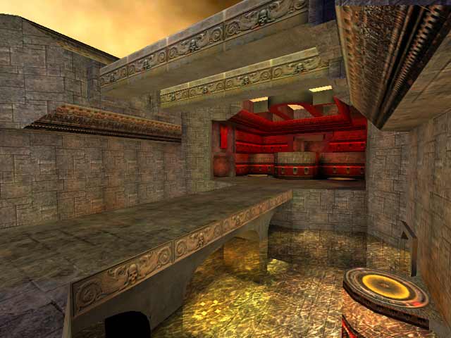
even though the health count for this level looks good on paper, it felt a bit sparse, especially for larger player loads. I would have liked to have seen more room for strafe jumping around the pads in the bases. The incorporation of the water elements as part of the game play was well thought out
Agree (1) or Disagree (0)
A well divided map with several ways to get the flag. I like the possibility to do a long way to it by water. Defense is quite easy enemys must pass a least one huge gab by jumppad to get the flag. Grab it you´ll like it...
Agree (1) or Disagree (0)
I like the map, but you really needed something else in the flag room I thought. Add a little more 3rd dimension to your map instead of having everything just on the xy plane. Overall I like it. Good attention to detail.
Agree (0) or Disagree (0)
i really like this level! it really doesnt give you much choice to hide. but isnt that what quake isn't about?
Agree (0) or Disagree (0)
I give such a high score because of the texturing. Even in the picture there the texturing is great. Make me happy :P
Agree (0) or Disagree (0)
Ok um hey i wasnt done!!!! I bumped my mouse in the wrong way. Anyways to finish up... Game play,frame rate, design, lighting,atmosphere,was pretty well ballanced. 8/10 Confusing at first,layout could be better, the flag area was hard to get to,(i think that was the plan..or via rocket jump) Should prove to be difficult online.
Agree (0) or Disagree (0)
Great over all map. (Man Tig got lucky this week.) I was lost and confused the first couple minutes of my first game. Water areas usually hamper game play but it worked well for this map. I saw the bots trying to escape with my flag through there. Big mistake since i had a pulse gun.
Agree (0) or Disagree (0)
I liked it, it looked pretty good, and the games were fun. But this was a RL DOMINATED map. Obviously this was to an extent intended (it IS in the middle of the central bridge) but with all the different shortcuts you can do with rocketjumping here, it's a little to powerful for my tastes.
Flag room was slightly off if you ask me, worst part of map. RG was smartly out of the way (good gun=out of the way to get) but the horizontal pads were just silly. It was far to easy to pick off people who didn't have RL (or for that matter bots who didn't know to rocketjump) as they made their way over.
Underwater regen was good, I liked the water tunnels though unfortunately bot's didn't use them. The PG area felt a little cramped, YA was placed well. That's about it =)
Nice job, 7 outa 10 due to flag room (honestly, redo that section of the map it would be so much better)
Happy Fraggin! Octovus
Agree (0) or Disagree (0)
