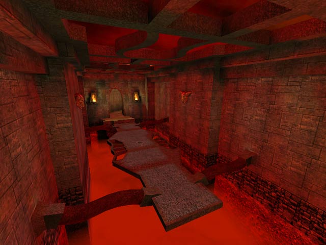
The Dirtchamber
The Dirtchamber by EraSerX
Comments
Add a comment
avatar
**Preview only**
Be sure to submit your comment
Formatting help
Submit
Preview
Cancel
Submitting comment...
avatar
FragTastic Rep. 2459
#8   07 Jul 2012
Man I love the devilish look to the map it makes me feel like I'm walking in Satan's house. I'd like to say that more weapons should of been added since there were a few but a lot of ammo, power-ups were added which kinda made the ammo useless since there were only one weapon of each kind and 2 shotguns. 6.5/10
Agree (0) or Disagree (0)
OO7MIKE unregistered
#7   14 Apr 2000
This is a very visually impresive level. The frame rates are high and the archetecture says much for its lava theme. This beautifly lit level has an outstanding atmosphere. MY only beef is that the only way out of the lava is to go skinny dipping. The game play with bots is ok..just dont put klesk of sorlag in there.(they are so very very dumb in this map. They both will just jump right in and squeal some sounds i have never heard in the game before!..hehe.)More than 6 players or bots for this map please. 9/10 I know making bots play well is hard so its only the skinny dipping spa that i cant get out of that brought this level down. A must for multiplay!!
Agree (0) or Disagree (0)
Frozen Fire unregistered
#6   11 Apr 2000
Ya the bots suck in this level,

but in multiplayer this level kicks a$$! I'd give this map a 10/10 for eye candy and a 7 for gameplay. Nice work EraserX!

Agree (0) or Disagree (0)
Rokscott unregistered
#5   11 Apr 2000
Hey Octovus !

I'm not having a go at you here but the reason this map does not play too well with the bots is that it wasn't optimised for them (I'm not talking about optimising the aas. file but rather the layout of the map).

All of the iD map were designed to make life easy for their bots to navigate because the A.I. aint what its cracked up to be.

Mind you Tig is still right when he says more clip brushes should have been used.

Agree (0) or Disagree (0)
Octovus unregistered
#4   10 Apr 2000
Yeah eRicB you took the words out of my mouth. Tig is right in that the bots are dumb, but in actualy fact they are so smart they come off as dumb, clinging to the edges rather than jumping in and heading to frag someone. If EraserX had to program them to do this sorry but it was a waste of time. Still a great map, with 2 exceptions imho. First, the rl placement. It is definitely in a cool area of the map (after all it is the levelshot room) but unlike I thought it would be that area is actually kind of out of the way. Perhaps this was to speed up gameflow, but as Tig said it is rather big so imo you could essentially cut that part out. Also, the ra was a little out of the way, you wouldn't really want to risk getting fragged for it unless you were alone in the room or you were already really powered up.

That said, I really like the megahealth room. The jump-jump again feature was nice, and the room aided gameflow a lot. Could definitely be improved upon (notably bots) but still a good map. From me, a 7.

Happy Fraggin! Octovus

Agree (0) or Disagree (0)
Rokscott unregistered
#3   10 Apr 2000
This is great looking map IMO.

Shame about the bot-play but hey, there you go. Worth a download for sure.

7.5/10

Agree (0) or Disagree (0)
Slater unregistered
#2   09 Apr 2000
This maps look and feel is alright, but the game play could be lacking. Not to mention you can rocket jump out of every room and land on the ceiling looking over the whole map and seeing a nice HOM effect. Would of been a great map, but the author needs to learn about how to use clip brushes.
Agree (0) or Disagree (0)
eRicB unregistered
#1   09 Apr 2000
I give id this much: the bots may be dumb, but they definitely have the instinct for survival.

In the area with the mega-health, I accidently drop down to the lava below and what did I see: two bots clinging to the railing of the pit waiting for me to frag them before I died.

Hilarious.
Agree (0) or Disagree (0)
Clear