**Preview only**
Be sure to submit your comment
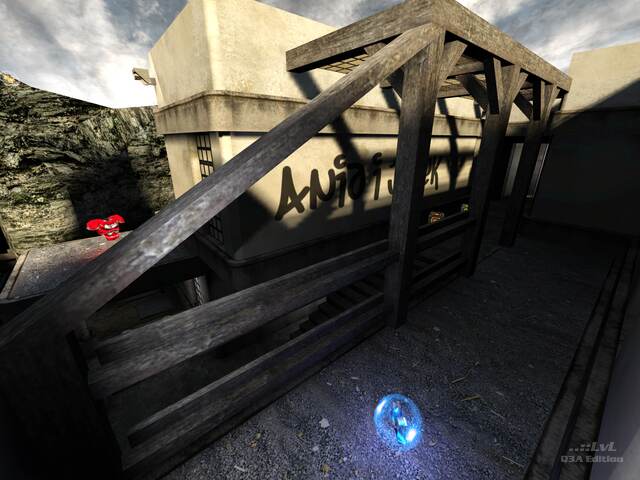
Very intense! Nice design and lighting. The teleport and jump pad gives a great flow to the game. It just feels a bit too small. But it's quite fun!
Edited 14.95 hours after the original posting.
Agree (1) or Disagree (0)
Genius Idea! I love it 9.5/10.
Agree (1) or Disagree (0)
Why is kakashiz saying "thanks"? It doesn't make a whole lot of sense. I mean, why does he need to say that when nobody really did anything for him/her?
And help from what?! What is he/she talking about?? As if he had help making a map???
Map:Quite a good map. A bit small, but thats okay. I would have liked a train running through the tracks and into a tunnel from the other for more ambiance, but pretty good map.
Agree (0) or Disagree (0)
WEEGEE
unregistered
#11 15 Nov 2010
How can you say thing about a map you may have not even played yet? What are the comments saying?
Agree (0) or Disagree (0)
@Tig. (^_^) . Yes i would just like to say thanks, nice, wow, and very nice. thank you to all for your help. i'm out now. :)
Agree (0) or Disagree (3)

Tig Rep. 2352
#9 14 Nov 2010
@kakashiz: How about something more than just 'thanks', 'wow, thanks' and 'very nice'. If that is all you want to say, that is fine, but there is no way you could be downloading and playing the maps between comments. One of the maps you said 'wow! nice' on was just a collection of sky boxes, only useful for developers.
Agree (2) or Disagree (0)
very nice
Agree (0) or Disagree (1)
Julek you should really test your maps over at Quake3World.com LEM forums, this way the "small" technical issues could have been avoided, thus not spoiling the otherwise really cool map.
Issues: Clipping, bots getting stuck, too cramped in several areas (easy fixes), sparklies (at least 4 of them).
I was wondering why I could not stay on the rock... clever use of slick texture. Was fun playing the map... but I really wish those issues had been fixed.
Agree (0) or Disagree (0)
Nice style, really makes you feel you are in some other game. It's a bit larger than jul32 which is cool; however the bots are getting stuck and the gameplay is still a bit too simple. Julek, you have a talent and style, I really wish you did a larger map one day!
Agree (0) or Disagree (0)
@All
Thanks for comments
@Pat Howard
thanks for the advice, I thought that the problems with bots is due to bad botclip placement
Agree (0) or Disagree (0)
fKd
unregistered
#4 06 Dec 2009
have to say,this map looks amazing and a good size for a good duel... nice work sir!
Agree (0) or Disagree (0)
I liked it too - initially. I just didn't think there was enough depth or variety to make it fun for more than a few games. Sorry for the giant review - I just had a lot of points to defend because I know a lot of people love Julek's style.
@Julek, The bot problems seem to be caused by broken clusters, I noticed the same problem in your last map. You HAVE to use the -forcedsidesvisible tag during your AAS compile if you are also using the -meta tag during your BSP compile otherwise your clusters will break.
Also, I thought it would've been awesome if once a game a big train randomly barreled out of that tunnel and ran over anyone on the tracks :).
Agree (1) or Disagree (0)
Jorge Luis Machin
unregistered
#2 06 Dec 2009
I actually liked the Julek´s map but Pat does have a point
I´m no pro player, can´t even strafejump decently, but I did rocketjump out of the map when I tried to do anything other than shoot at the other players
So, "no alternate paths or trick jumps" and "routes too short to ever gain significant speed" are accurate comments
But, as I said I like the map. Great visuals indeed!
Agree (0) or Disagree (0)
genial!!!!
Agree (0) or Disagree (1)

