Added 23 Dec, 2008
Comments
Add a comment
**Preview only**
Be sure to submit your comment
Be sure to submit your comment
Submitting comment...
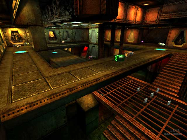
Aside from the theme of the map which gives me the good nostalgias the thing that stands out to me here is the lighting. At the end of the day the geometry is fairly plain, textures are sort of repetitive... but the lights placed within an otherwise dimly lit level with their different colors, shades and intensities really serve to flesh out the areas and add the visual variety needed to break up what would otherwise begin to feel "samey" all over. The successful atmosphere of this level leans heavily on that lighting and I think Nickster did a hell of job understanding and applying that. The place has a really cool believable feel to it.
Agree (0) or Disagree (0)
Now this is a kind of map i have been waiting for, Extreme, Fun, Excellent. 10/10
Agree (0) or Disagree (0)
Wow! this is very good map in comparison to some maps here it is def. a keeper! Like Anwulf had said above this is how Doom/Quake would look like with Q3 engine. And soundtrack is cherry on the cake. Great job! d/load it~!
Agree (1) or Disagree (0)
