Added 18 Mar, 2000
Comments
Add a comment
**Preview only**
Be sure to submit your comment
Be sure to submit your comment
Submitting comment...
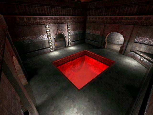
Good map if you like to admire the scenary,well at least the finished parts of it that is.I found several gray boxes of unfinished texture and for some reason bots will not load so I found myself just walking around in single player mode. Once finished it will be a nice map.
Agree (0) or Disagree (0)
An ok layout- too symmetric, farily well-made architecture, but poorly lit, and the rooms/areas were too large for what was in them. Ornamentation was also too sparse. One thing of note I didn't like was the jump up to the corridor with the red armor, when I jumped onto that pad I found myself in a pitch-dark area and didn't know where I was, until I turned around. Then when I reached the end of that corridor I was in another pitch-dark area and didn't know there was a drop-down there. Also, the water areas don't really add anything to this map.
Seems like another unfinished map to me.
Agree (0) or Disagree (0)
