Be sure to submit your comment
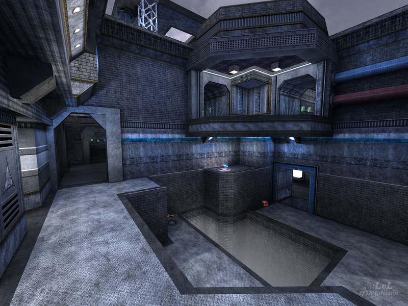
the map could be larger but it's still a fantastic map.
Edited: 14 Feb 2012 AEST
=)
nice to see them getting used in other levels. in fact its not just nice, its totaly awesome! thanks for finding another home for them.
as for the level, nice work. keep it up!
Looks-wise, a very nice level. Clean, and not over-detailed. Good work.
Now, on to the important part: the gameplay.
I have no real issues with the item loads or placement, after all, a mapcfg can fix this.
However what I do have a problem with (as I do with most maps I don't get into a lot) is the scaling.
Vertically and horizontally, it is far too big to make the layout effective enough, and mind you, I'm talking about Promode play here (I don't even bother with normal Q3).
I found myself needing items to be more within reach, and they simply weren't because of the scaling.
While it's uniform for the size the author has built it on, it's just too large. The formula style of layout this map uses calls for a tighter scale.
Good effort, but destroyed by lack of attention to scale. I'll look fwd to the next work by Sokar, I'm sure it will be quite promising.
very nice.
