Added 25 Sep, 2003
Comments
Add a comment
**Preview only**
Be sure to submit your comment
Be sure to submit your comment
Submitting comment...
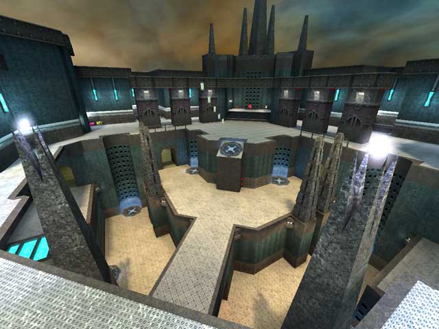
Quite fun couple of maps, specially the one shown in the photo!
Agree (1) or Disagree (0)
Station Fragfest: Dynamic, connecting, and chaotic. Excellent weapon/armor placement. I've noticed the bots use the SG and RG the most.
Agree (0) or Disagree (0)
Would be nice to see a ctf version of the map you can see on the screenshot but I guess the author wont read this - sad.
Agree (1) or Disagree (0)
thanks scampie for the comments. hey! i got a shiny fetish!:)) these two maps were pretty old, when i released them i was glad it was finally done. new works are comming your way but this time i will beta-test them at quake3world/forums first.
---
you can download the textures used in these maps on my site with many more unused. ;)
---
cya
Agree (0) or Disagree (0)
The exterior of the first map is totally awesome... but I felt the interior areas lacking. Rather boring, squarish design with an overload of repetitive shiney textures.
The second map suffered with the same shiney textures, and I felt it was overall not as appealing without the big well made theme of the first map. It also seemed rather boxy.
Both maps have a good solid layout, and use completely excellant textures. I think with a bit more focus on a single coherant theme throughout a map and more time spent on architecture of each area, this author could pump out some amazing stuff. I look forward to more. :D
Agree (0) or Disagree (0)
