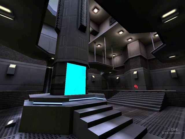
Tri_Clonus
Tri_Clonus by GranMasterQ
Comments
Add a comment
avatar
**Preview only**
Be sure to submit your comment
Submit
Preview
Cancel
Submitting comment...
avatar
AEon Rep. 770
#4   21 Aug 2009
Hmm... I found the map totally confusing, only after running the map in dev mode (noclip) did I understand why. The map uses quite nice architecture elements, but standard boxy corridors, that have been pasted all over the place. The result are four arenas, that differ, but only slightly, making it very difficult to orientate. The arenas are, IMO, too cramped, you keep on getting stuck in the "trench" around the central TPs (generators), and the TP transport is weird too, you seem to teleport and then fall down some "tube", very disorientating.

Pardon the whining, but I really like the design, but the above issues make the map very much less enjoyable than it could be, alas. It would help to reduce the gameplay to two arenas, that are better connected (not just boxy corridors that look the same), some areas need to be better lit, make the remaining last two arenas larger, remove the gimmicky effect on the TP falling, and this map would be really awesome gameplay-wise.

Agree (0) or Disagree (0)
GuitarMan unregistered
#3   16 Dec 2002
Nice map. I like it, it feels simple but in this case that's OK; a good alternative to the high amount of detail and design of "Contortion". :)
Agree (0) or Disagree (0)
EBUK unregistered
#2   16 Dec 2002
"GMSQ shows true promise"

...definatly, I can't wait to see more from the author :)

Agree (0) or Disagree (0)
GONNAKILLYA! unregistered
#1   15 Dec 2002
Well...I'm a bit biased I guess. ;-)

But I thought for a first release that the GMSQ shows true promise. The bots did give a challenge (at least for me) and overall I had fun playing the map.

If I had a nickel for every "first release" that was awesome I wouldn't be able to buy a cup of coffee.

Keep at it, GMSQ.

Agree (0) or Disagree (0)
Clear