**Preview only**
Be sure to submit your comment
patridiot
unregistered
#15 28 Feb 2000
I wish Tig would put up the meat pack. White meat is a really effective map. I likewise wish that CRT
would stick it in RA3 as a 1-on-1, or 2-on-2 map although I'm almost certain he won't
(based on the fact that, as of yet, the ingenious bastard has refused even a glimpse at the bona fide map team's offerings leading me to conclude that he is a monumental sadist). Really nice aesthetics on this one boys, better than ID's maps in many ways, and if the number of jump pads could be reduced just a bit it I would be using words
like stellar and stupendous rather than relatively weak and blatantly subjective phrases phrases like "cool". As for this map, whose review space I am defacing, it doesn't bring anything new to the table.
It is ordinary, like the blonde girl in American Beauty.
Agree (0) or Disagree (0)
patridiot
unregistered
#14 28 Feb 2000
I wish Tig would put up the meat pack. White meat is a really cool map. I wish CRT
would stick it in RA3 as a 1 on 1 or 2 on 2 map although I'm almost certain he won't
(based on the fact the ingenious bastard has seemingly refused released a single screen
shot for the maps for the mod yet). Really nice aesthetics, better than ID's maps in many
ways, and if the number of jump pads could be reduced just a bit it I would be using words
like stellar and awe inspiring. As for this map, it doesn't bring anything new to the table.
It is ordinary, like the blonde girl in American beauty. People with bad computers will
complain about frame rates and people with good computers will smile smugly.
Agree (0) or Disagree (0)
d3f3nd3r
unregistered
#13 28 Feb 2000
D'oh, I did it again, I'm such a lame ass. Sorry Tigger. ;)
Agree (0) or Disagree (0)
d3f3nd3r
unregistered
#12 28 Feb 2000
I know, I might have been a little worked up when I made that comment, because I really like this map. ;) Also I didn't mean to devalue your opinion, which is obviously a very valid one. I was just trying to point out that there are two schools of thought when it comes to variance in style within one map. I really like Johnny's style when it comes to that because it seems to me that it brings a greater level of realism to the game, while still maintaining the fantastic element.
BTW- I'm also a big fan of your 'Last Rites' map, nicely sized and great use of powerups.
Agree (0) or Disagree (0)
d3f3nd3r
unregistered
#11 28 Feb 2000
I know, I might have been a little worked up when I made that comment, because I really like this map. ;) Also I didn't mean to devalue your opinion, which is obviously a very valid one. I was just trying to point out that there are two schools of thought when it comes to variance in style within one map. I really like Johnny's style when it comes to that because it seems to me that it brings a greater level of realism to the game, while still maintaining the fantastic element.
BTW- I'm also a big fan of your 'Last Rites' map, nicely sized and great use of powerups.
Agree (0) or Disagree (0)
Mr.CleaN
unregistered
#10 28 Feb 2000
heh, nobody said you had to agree with me d3f3nd3r, those are simply my personal observations about the map.
Agree (0) or Disagree (0)
d3f3nd3r
unregistered
#9 28 Feb 2000
Yeah, my fault tigger. Sometimes you get frustrated and just go trigger happy on the mouse, y'know? ;)
Agree (0) or Disagree (0)
Tigger-oN
unregistered
#8 28 Feb 2000
d3f3nd3r - just hit the submit button once :] (I know the planetquake webserver is having problems, sorry everyone)
Agree (0) or Disagree (0)
d3f3nd3r
unregistered
#7 28 Feb 2000
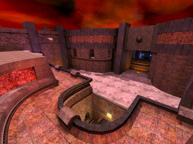
Hmm I gotta disagree with you Mr. Clean, I think this map looks great.. coulda been more vertical elements but I don't think that's what he was going for. When it comes down to it, the use of colored lighting, varied texturing and the like is a matter of personal taste, and I personally like the style of this map. Lighting and texture in real life aren't sanitized and uniform (unless you're in an office or hospital or something), so why should they be in quake, which is after all about creating a simulated reality to your own liking.
Agree (0) or Disagree (0)
Mr. Dirty
unregistered
#6 27 Feb 2000
Is teh reviewer a friend of the map author?? I have seen better maps get slammed. I have only one question: Where is the gameplay????
Agree (0) or Disagree (0)
shithead
unregistered
#5 27 Feb 2000
u mapz rox0r johnny =D
Agree (0) or Disagree (0)
Mr.CleaN
unregistered
#4 27 Feb 2000
This map had some interesting elements to it, but overall it suffers from a mish-mosh syndrome. Too much of the map seems disjointed from the rest with too large of a variation in texturing and archtextural styles. The lighting could have used some more tweaking, many areas were too dark or in the case of colored lights, too intensely colored. I ran into a few clipping problems as well.
Agree (0) or Disagree (0)
Abomination
unregistered
#3 27 Feb 2000
this is a great map, very creative but mostly full of good item placement and smart design. Johnny = Johnny Law right?
Agree (0) or Disagree (0)
d3f3nd3r
unregistered
#2 26 Feb 2000
This map is awesome, the metallic texturing and architecture are very nice (although not as complicated as phantasmagoria), and the gameflow is really excellent. I didn't think it felt cramped at all, maybe there were a few more hallways than most of id's maps but I don't have a problem with that, I like that style of combat. Hopefully this one will make it onto some servers. Way to go Johnny!
BTW- that 'bubble window' on top of one of the buildings is cool, I wish you could get up there..well ok you can get onto the edge of the roof but not onto the roof itself...
Agree (0) or Disagree (0)
Timothy 11 BlacK
unregistered
#1 26 Feb 2000
I don't really see how this is a big improvement over Phantasmagoria,since that map didn't have to be improved and it was pure genious!Anyone that had a prob w/ that map is on some good crack!This map is really cool but I still think Phant is better.Keep up the amazing work Johnny!
Agree (0) or Disagree (0)

