**Preview only**
Be sure to submit your comment
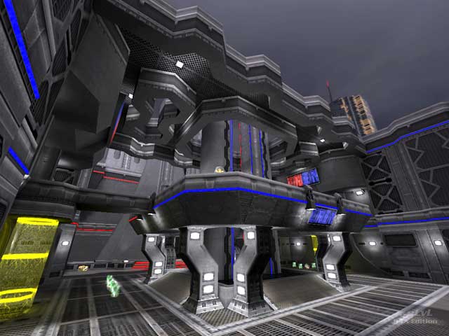
Like Tetzlaff said, the fact that this is a dual-symmetric (whatever the term is) CTF map makes the gameplay a lot more dull than it otherwise would have been. The fact that many CTF maps, despite being symmetrical across the entire map for obvious balance reasons, have asymmetrical bases, is what makes them so interesting design-wise. I suppose it does fit the map name though, since a palindrome is a word that is the same spelled forwards and backwards, just like the layout of each base is the same even if flipped.
I do personally disagree with Myth's comment about the verticality though, which left me rather confused; there are only 2 stories in this entire map, and the vertical distance between those floors is not any greater than most standard competitive CTF maps. Maybe it is because the map is fairly tight and thus the angles the players will face each other between floors is thus steeper than if the map was more open?
The atmosphere is fantastic, though. I don't think there are many better examples of dystopian futurism in Quake 3. The ominous sound effects just complete it, too.
Edited 2.85 minutes after the original posting.
Agree (2) or Disagree (0)
Very Nice Map! 9/10
Agree (0) or Disagree (0)
Takkie
unregistered
#11 07 Sep 2009
This is a very nice CTF map.
Even the bots play it kinda cool...
excellent!
Agree (1) or Disagree (0)
Totally agree with the review!
Agree (0) or Disagree (0)
Salinga
unregistered
#9 21 Sep 2002
This map is Q32EF compatible, so it can be played with "ST: Voyager - Elite Force".
To find out more about the mod, visit:
<a href="q32ef.fragland.net" Target="_BLANK">q32ef.fragland.net</a>
Agree (0) or Disagree (0)
Tetzlaff
unregistered
#8 21 Aug 2002
Nice architecture and great use of textures. But a layout like this, where not only the whole map, but also the bases are symmetric by themselfes (like q3ctf3), quickly becomes repetitive.
Agree (0) or Disagree (0)
not entered
unregistered
#7 21 Aug 2002
This map sucks ass, a clowns ass to be exact.
Don't you have wolfenstien maps to make or something?
Agree (0) or Disagree (1)
Ghettobunny
unregistered
#6 20 Aug 2002
This map is so money, and he does not even know it!
Agree (0) or Disagree (0)
Yak Nuts
unregistered
#5 20 Aug 2002
This map is TIGHT!!!
Agree (0) or Disagree (0)
Meatboy Dogfood
unregistered
#4 19 Aug 2002
Hey Eh go grab a map and give a reveiw. Make us proud.
Agree (0) or Disagree (0)
Myth
unregistered
#3 19 Aug 2002
I like the base rooms very much.
imho the map's vertical scale could have been toned down a little bit.
An enjoyable ctf map with excellent use of textures.
Agree (1) or Disagree (0)
eh
unregistered
#2 13 Aug 2002
eh... it's a decent map, but I won't be playing it over and over. Looks (and reviews) can be deceiving.
Agree (0) or Disagree (0)
nitin
unregistered
#1 13 Aug 2002
very nice map, although it's a killer on some video cards with all those multipass shaders.
Agree (0) or Disagree (0)

