Added 09 May, 2002
Comments
Add a comment
**Preview only**
Be sure to submit your comment
Be sure to submit your comment
Submitting comment...
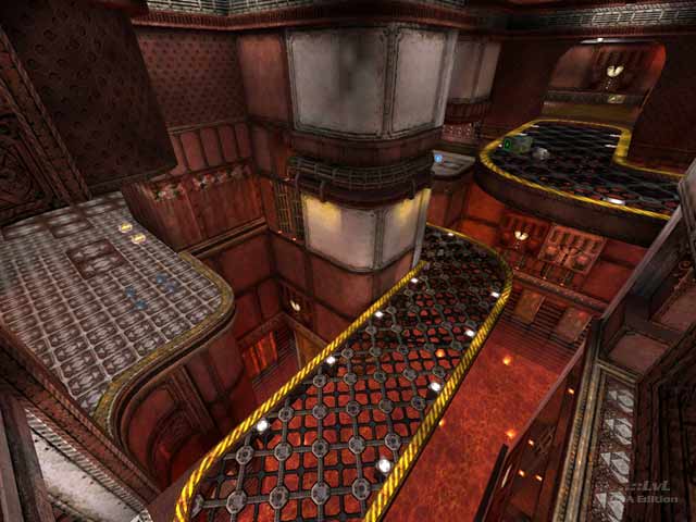
Well, out of curiosity I decided to check this out. The idea for the contest seemed pretty cool, even though it did severely limit what the authors could do, but at least it`s a good layout. I disagree with the review about Red Ribbon being the best result however - I personally thought the one with the trees and waterfalls, etc. was the best of them. (Ironically, both that and Red Ribbon use the same texture set, lol?)
Agree (0) or Disagree (0)
