**Preview only**
Be sure to submit your comment
Well, I've played the CTF version before and it just doesn't feel like a FFA map at all. It lacks verticality.
Agree (0) or Disagree (0)
1v4n
unregistered
#10 06 Nov 2017
Looks like another official Dreamcast map!
Agree (0) or Disagree (0)
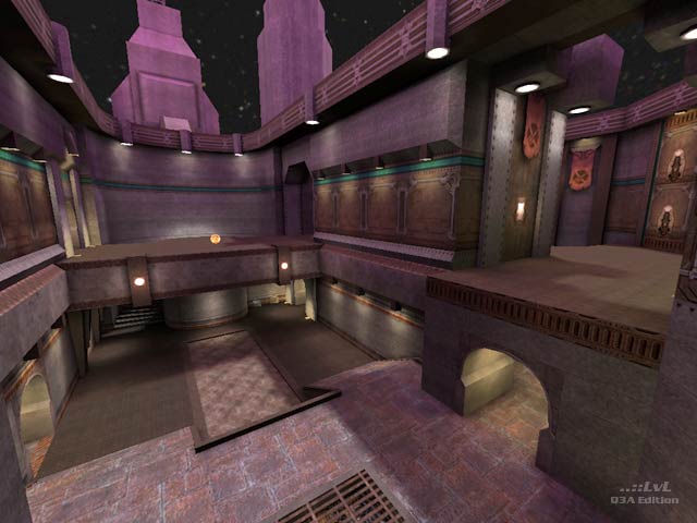
This is a solid offering. The towers lit by red lights are vaguely reminiscent of Quake 2. Dan M's review is accurate; do download this map.
Agree (1) or Disagree (0)
hannibal
unregistered
#8 08 Feb 2002
I like the size for tourney...and despite a few niggles here and there, a solid DM map from Mr. CTF :p
Agree (0) or Disagree (0)
elendeNATTER!
unregistered
#7 08 Feb 2002
it's a Keeper since Weeks already. nice atmosphere.
Agree (0) or Disagree (0)
ki11ingtime
unregistered
#6 08 Feb 2002
With the ramp trim to stairs, there is many nice ramp jumps in CPMA.
Agree (0) or Disagree (0)
Octovus
unregistered
#5 07 Feb 2002
Is this really a first ffa map, as the dm1 suffix suggests? If so, congrats, and congrats anyways. The map does seem rather ginormous for tourney play, but I don't like tourney too much anyways...and this played great with 5 players in an FFA. That's the max I guess, but 3 really seems nowhere near the level's capacity. Anyways.
The look is nice and clean, if not very suggestive of the supposed lunar landing theme. Bouncepads and stairways make for good vertical connectivity, with plenty of hallways and wide open spaces in between. Connectivity between rooms on the upper levels is very limited, though this might be intended to limit access to powerful items. The weapons are made fairly even use of with the exception of the GL; putting it just a step aside from a player's path made it all but unused due to it's proximity to more popular weapons.
I really enjoyed it as an FFA, so my only complaint might be no powerups...but it was intended as tourney, so 9 from me.
-Octovus
Agree (0) or Disagree (0)
ki11ingtime
unregistered
#4 07 Feb 2002
Telle probably would have been a good idea
Agree (0) or Disagree (0)
Myth
unregistered
#3 07 Feb 2002
I remember seeing soem screenshots of this a while ago somewhere.
Cool layout. The map reminds of Q3DM6, partly coz of the purple-ish look, but also it flows similarly as well (no teleporters, few quite high jump pads etc).
I would have liked a teleporter near the R/L as that little area is a dead-end.
I give 8/10
Agree (0) or Disagree (0)
*papri-K*
unregistered
#2 07 Feb 2002
I have been playing this map for about two months now, it's staying on my HD
:)
Agree (0) or Disagree (0)
ki11ingtime
unregistered
#1 07 Feb 2002
Had a quick game (bot), really like the brush layout, nice conectivity.
Agree (0) or Disagree (0)

