Be sure to submit your comment
Two words to describe the gameplay: Very flat.
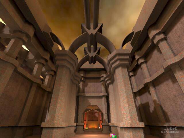
The layout is impressive in scale, but this hurts the gameplay. The rooms have little variation beyond big and open, with a ramp or two alongside; the Quake 3 engine can't handle much more than that so it's understandable (my system was already complaining) but as I've said in other threads that's a design choice.
It's probably worth grabbing just for the looks, but don't expect too much out of the gameplay. Long distancing rail and/or plasmaguns are the order of the day in most of the map, while the few enclosed spaces (and they are very enclosed, hardly any inbetweens) demand rockets and shotguns. Blandish gameplay, awe-insipiringish (perhaps that a bit exaggerated, the textures aren't very unique) architecture.
-Octovus
P.S. 8 from me.
