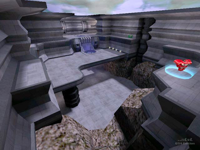
simplicity
by Geit
simplicity by Geit
Comments
Add a comment
avatar
**Preview only**
Be sure to submit your comment
Formatting help
Submit
Preview
Cancel
Submitting comment...
avatar
raspatan Rep. 4660
#7   07 Mar 2021
As a FFA map (recomended load), this is too small. For a 1v1, this is super Intense! The teleports make this map extremely fast. Item balance is amazing. This is top stuff!
Edited 22 seconds after the original posting.
Agree (2) or Disagree (0)
avatar
FragTastic Rep. 2459
#6   07 Jan 2012
Now i like this map its fun with rocket arena.
Agree (0) or Disagree (0)
avatar
HelterSkeleton Rep. 6698
#5   31 Aug 2008
this is a very well thought out level. i like the use of location markers and the choice for the bouncepads. rg ammo and sg ammo are a little too close to their respective weapons but otherwise the layout and item placement are really nice. nice enough to notice and nice enough to forgive. i think this is geit's best map. a real sleeper too
Edited 3950.48 days after the original posting.
Agree (1) or Disagree (0)
Myth unregistered
#4   24 May 2006
A quality map. I question putting the RG and LG so close, but the layout is spot on. The asthetics are very tidy and suit the style of the map, my only grumble is that the rock texture looks a bit dated.
Agree (0) or Disagree (0)
avatar
bluemonkey Rep. 40
#3   17 May 2006
Cracking map this one. Beautiful, lovely size for late in the evening at LANs when people are getting tired of playing UT2k4 and you can convince them to play some Q3. Great with bots too.
Agree (0) or Disagree (0)
hannibal unregistered
#2   13 Aug 2001
is anybody else getting an error with the elevator sounds?!? Anytime it moves, I get an error message saying "trying....whatever.wav...now using default"? I wouldn't care if the game didn't display the damn message!! Anyway Geit, pretty fun duel map here, and I actually like the clean, austere atmosphere.
Agree (0) or Disagree (0)
Octovus unregistered
#1   10 Aug 2001
Hello! This map is yet another fun entry into nunuk's contest; that guy has some of the best vision in the Q3 community, that's sure as hell.

Geit's map fares well in many areas, but almost fits better into the category of normal maps than into those in the spirit of nunuk's challenge. That's not to say Geit didn't try to do what nunuk was looking for, or to say that he broke any rules. It's not even to say that he meant for it to stand out from the other entries. But it's really true.

The brushwork isn't at all overwhelming, as it is in many of the other challenge entries. This is of course one thing nunuk was looking for. But this map excels in looks; when I loaded it up originally, I plum forgot it had only 9 textures in it (whether that number includes bouncepads and such I've no idea). It looks pretty. But mroe importantly, it plays nicely too! Fun stuff. A lot of trick jumps possible. I imagine this would be nice in CPM, if I liked CPM, but then again, lots of things would be nice if you liked them, wouldn't they?

Ok, I think I've been in the sun too much. I hope Rogers doesn't die again. I need a bloody excuse to stay in tomorrow :-p

An 8 from me!

-Octovus

Agree (0) or Disagree (0)
Clear