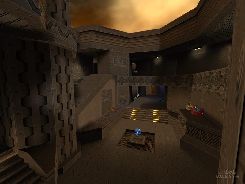
Normally known for his highly regarded CPMA maps, swelt's Wee Bugger is a bit of a departure, being one of the few maps he designed with traditional vq3 physics in mind, and was made for a contest held by the now-defunct levelsource.
The map is dressed up in textures from evillair's Quake 2 pack, and they are put to good use here. Don't expect anything mind-blowing; after all this is a map geared towards competitive play, but for what it is, it certainly doesn't look bad. The lighting is also thoughtful, accentuating the dimly-lit hallways with some nice contrast and also featuring some selective colored lights to denote key areas.
The layout follows a somewhat unconventional L-shape divided between two floors. The central room houses the MH, and the branching areas, which connect to the center room but not directly to each other, each contain a YA and a RL, along with some other important weapon (LG on one side, RG on the other). Notably, there is no RA. The YA near the LG is a bit weaker position-wise due to being on lower ground, while the one next to the RG is higher up. Next to the LG is a teleporter to immediately go to the second floor, still on the same side. In FFA, the Invisibility spawns adjacent to the RG.
The L-shape of the map means the paths from the branching rooms to the center room are very limited, creating choke points that a skilled duel player can easily take advantage of to dominate the map. This makes the RG an especially oppressive force to be reckoned with here, though swelt clearly knew this so he put it in a watery pit that sloshing around in will lead to a watery grave if one is not suitably geared up. The MH, being in the center of the map, has the lesser weapons (the SG and GL) to balance out the fact that it isn't at a dead end. If you want better firepower you'll have to compromise your position, and if you just hang out in the center trying to have access to as many routes as possible then the other player, with enough wits, will stack up and make you wish you took more risks. The design of this duel map is rather unconventional, but it works. Kind of a shame we do not see more L-shaped 1-on-1 maps like this honestly.
Although this map is designed for vq3, it looks like swelt sneaked in a few CPMA trick jumps nevertheless; the most notable one is a double jump that can be performed off of the bottom half of the lightning / rocket ammo platform next to the MH. These trick jumps are not necessary for the map to flow well and it could be argued that in terms of balancing, maybe it's better for players to not be able to easily grab the MH, double jump to the second floor, and then hop over to grab the YA next to the RG.
This map shows that swelt is a flexible mapper; being able to adapt to designing for different styles of gameplay and producing a strong release in the process. "wee bugger" is well worth checking out for competitive 1-on-1 fans, especially those who want a map that breaks away a bit from standard duel map layout norms.
Reviewed by EmeraldTiger
Ranked: 4 out of 5 (4 votes)
Download: Wee Bugger by swelt
