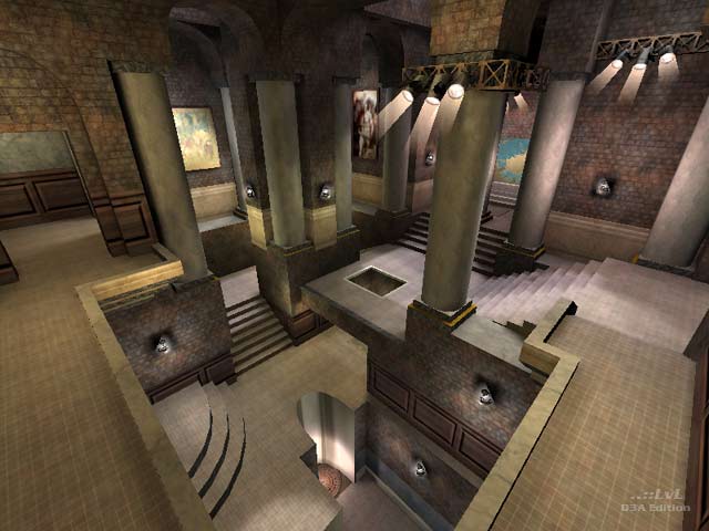
Davinci
by WaSp
Davinci by WaSp
Comments
Add a comment
avatar
**Preview only**
Be sure to submit your comment
Formatting help
Submit
Preview
Cancel
Submitting comment...
avatar
Alice Rep. 635
#24   02 Dec 2016
I totally agree with Takkie. This map is a evergreen. Very special aesthetics, unique atmosphere and great gameplay.
Agree (1) or Disagree (0)
avatar
Takkie Rep. 1858
#23   02 Feb 2015
Awesome map. Offers something different than most most maps. There are a few other 'museum' maps but this has absolutly the best gameplay. After many years (13? wow) i'm still not bored playing this one!
Agree (1) or Disagree (0)
avatar
FragTastic Rep. 2459
#22   18 Jan 2012
Lots of fun!. 9.5/10.
Edited: 18 Jan 2012 AEST
Agree (0) or Disagree (0)
rEdD unregistered
#21   12 Feb 2002
SWEET MAP! LOVE IT

ended up with a job with ratbag :) nuff said

Agree (0) or Disagree (0)
MrBean unregistered
#20   08 Jul 2001
The map is big. Enough said about that. What I enjoyed besides the playability was the theme. Not just another gothic castle doom and gloom place but a museum. The map is creative and just plain fun. It in fact reminds me of some of the art museums built around the turn of the century. Nice touch on this one.
Agree (0) or Disagree (0)
Crash54 unregistered
#19   15 Feb 2001
A wonderful level!!!...Extremely enjoying. The textures and layout are gorgeous, and while the file size is small that map is fair big. A minimum ranking of 9.
Agree (0) or Disagree (0)
GEEFELLY unregistered
#18   04 Feb 2001
LOVED IT AND WILL ALWAYS LOVE IT

ALL OF THEM ARE GOOD

Agree (0) or Disagree (0)
me unregistered
#17   30 Jan 2001
I truly can't find the scale problem, in fact it would be small if we are talking about museums. I have nothing against the upstairs size, Q3 standard size seems small for me, in fact. Layout is really good for FFA. And the look is nice. I could be finished better, but that will low the r_speeds, so the map is good enough for me.
Agree (0) or Disagree (0)
WaSp unregistered
#16   29 Jan 2001
Thankyou for the comments everyone,and Dagwit..WOW..thanx for taking the time man ;-) and Excelsiore.....It didnt even accure to me...a good point an I will watch for it next time.

As a mapper I have many...MANY...faults,but downloading maps from the greats and the inspiration their work gives and the sheer enjoyment of it keeps me going ,and the many kind emails I recieve help as well:-)

But I have to add that this is the first time in the 5 years I have been involved with quake and its community that I have walked away from a project with a bad taste in my mouth.

anyways.....I hope the majority who took the time to dowload Davinci get a good 5-10 minutes out of it :-p

thanx again

Agree (1) or Disagree (0)
Anubis unregistered
#15   29 Jan 2001
Needs a little bit of polish WaSp, but I really like the originality. Good stuff

For those of you interested in our beloved Scampie, enjoy some reading:
www.qmap.org/qthread.php3

Agree (0) or Disagree (0)
killazontherun unregistered
#14   29 Jan 2001
jk :)
Agree (0) or Disagree (0)
killazontherun unregistered
#13   29 Jan 2001
atocious
baleful
dire
frightfull
horrible
horrifying
menacing
minacious
offensive
ominous
sinister
ugly
vile

:)

Agree (0) or Disagree (0)
Dagwit unregistered
#12   29 Jan 2001
Holy Sheet, LowGun, you obviously have too little time on yours . . . no, to be fair, it's understandable that an untrained and inexperienced eye should fail to discriminate between the undoubtedly overworked gothic style, and this classical style, which is used in only a handful of maps (Lloyd Morris's 'Ancient Archipelago', lloydmdm2, being the most famous example).
Agree (0) or Disagree (0)
LowGun unregistered
#11   29 Jan 2001
Holy Sheet Dagwit, you have too much time on your hands my friend....

This map is decent but this look is starting to kill me...what I really want to see is more innovative looks like Flying Pluto and the Rhapsody in blue....

Agree (0) or Disagree (0)
Dagwit unregistered
#10   29 Jan 2001
"Probably the worst, most incoherant, badly designed, and unattractive map I've seen in a while". If Scampie only downloads the best maps by the best mappers, that comment might just be believable. I download pretty much everything I can find: in my 'Maps-recent' folder I currently have 39 maps. Five are so framey as to be effectively unplayable; six are so appalling only their makers' mothers would play them, while biting their tongues; nine are fair to decent; eleven are more or less good; and, it having been a pretty good crop, eight I rate as excellent.

From this perspective WaSp's map comes somewhere between good and excellent. The scale of the map is about right for a public building made to impress its grandeur on the visitor. The layout has the requisite amount of drama.

The texturing is impressive at first sight, but there are areas which don't bear close inspection. In particular the brick arches are wrong: not only does the brick texture on the curve of an arch not mesh believably with the texture on the side, but in reality a brick arch would have an 'arch-ring' of bricks called voussoirs, often slightly wedge-shaped, laid to form the curve of the arch - they're needed to transfer the load of the wall above safely to the sides of the arch. Brick is, of course, the wrong material anyway for what is meant to be a grand public space, but stone arches also need an arch-ring of voussoirs. Tricky to map, I'm sure, but necessary if the architecture is to carry conviction.

Another problem: when I tucked myself in behind the central pillar above the stairwell overlooked by the RL balcony, I was able to see through it.

The gothic lamps are OK, but the white glare of the techno lamps on the brickwork somehow just doesn't work. The shaded metal textures on the jumppad hollows aren't a success either.

Scampie is more or less right about the quality of the artwork textures. Real tapestries, it is true, are about as cruddy as they are here - I never look at a tapestry without part of me thinking 'Why don't they get rid of this filthy, faded old thing and buy a new one?' On the other hand real tapestries don't have visible joins where textures don't quite match, nor is the heavy tapestry fabric particularly keen to flutter in the breeze: I seem to recall that tapestries originally functioned as draft excluders. The tapestries should hang still, and the rest of the artwork might have originated in better reproductions or been scanned in better detail.

On the teleporter issue: id's teleporter design was an attempt at a compromise that would look good whether in gothic, space and techno maps. In fact, it really only works for gothic maps, and even there it can be bettered. No-one aiming at a consistent aesthetic should now be using it in techno maps. And it would certainly be completely out of place in this vaguely classical design. I rather liked WaSp's replacement.

All in all, then, this map could be improved. But 'the worst . . . in a while'? It's better than almost four out of five of the maps I've looked in the last week.

Agree (0) or Disagree (0)
Scancode unregistered
#9   29 Jan 2001
Nice theme WaSp,

This map seemed largish at fist but was open enough to be busy with 3 players, despite the fact the r_speeds can climb from that openness.

I agree with Excelsiore about the stairs, definitely too high for q3. It didn't really take any fun out of it, u climb them fast. Just feels a bit un-natural.

If this map was half its scale, it would do magic + the rail would be less dominant.

One other minor tweak, the jumpads look cool but are kinda outta place with the theme. But, it definitely feels museum`ish besides that.

gj.

Agree (0) or Disagree (0)
Shovel unregistered
#8   29 Jan 2001
Scampie: why are you so bitter?

Wasp's map is far from as bad as you feel it is, which suggest you have something else stuck up your arse?

Agree (0) or Disagree (0)
Abyss unregistered
#7   28 Jan 2001
Great map!!, and yeah, it may seem a little out of scale to some, but who cares, It looks good, fun to play, I like it a lot, congrat's, and keep it up
Agree (0) or Disagree (0)
Excelsiore unregistered
#6   28 Jan 2001
This map looks very nice but if you get ahold of the rail you can pretty much own it. The thing that's most annoying is that the steps are so steep in some places you become totally blinded when climbing them.
Agree (0) or Disagree (0)
botman unregistered
#5   28 Jan 2001
This map makes me feel like a fly on an ugly wall! What's with the scale of this thing? Are you sure you made this for Quake3 coz it feels WAY too big?

Feels like ya rushed it when you made it, it doesnt feel finished.

Your layouts not bad, I'll give u that much but the architecture is rotten - your jumpads look egg shaped?!?!

Redo this level, its still gotta lot to go before its ready imo.

On to the next one, pleeezz

Agree (0) or Disagree (0)
Scampie unregistered
#4   27 Jan 2001
Probably the worst, most incoherant, badly designed, and unattractive map I've seen in a while. nothing to stand out except the fact that the map is very large scalewise. all the artwork textures look grainy and undetailed. The teleport thing doesn't ever look like a teleport, which rubs me the wrong way. nothing new, or vagely inspirational here.

I can't see anything that makes it worth a download.

Agree (0) or Disagree (0)
Dadzilla unregistered
#3   27 Jan 2001
YA_FRIGGIN_HOO! new favorite map...love the architecture & decorations & layout....WAY cool...

What ELSE ya got in yer bag o' tricks, WaSp?

Agree (0) or Disagree (0)
The Hubster unregistered
#2   27 Jan 2001
Good stuff my friend! Keep it coming on, the WaSp trademark is back again:-)))
Agree (0) or Disagree (0)
ShoveL unregistered
#1   27 Jan 2001
I really like this map, not only does it look nice and original, it seems to flow just right, Wasp has IMO nailed the gameplay!

Good work buddy!

Agree (0) or Disagree (0)
Clear