Be sure to submit your comment
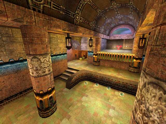
Must have influenced a mapper or two...
one thing i see in a lot of maps is that people don't seem to have any sense of architecture; if one room's ceiling is made of wood, and the adjoining room's isn't, there MUST be a transition: a decorative strip simulating a joint (no... not THAT kind =).
the textures are pretty scatterbrained, too, which is a shame, cuz some rooms are done pretty well, while other aren't as good, and then they're thrown together into one map. the net result is a map that appears unbalanced, with out of place areas, contrasting (in a not-so-good way) architectures and textures, and a generally slight "mish-mash."
also pay attention to the details... some textures flicker at poly seams, and tend to shift all around. (one spot (only on i saw) in the map is under the ledge in the BFG room, where the skeleton is sitting. check the underside of the ledge.).
