Be sure to submit your comment
re. electrical waves on the lg holder. This was my intention but it's very difficult to do convincingly. In the end I was pretty happy with my dirty beam.
re. all the gameplay points. I accept them all. One lesson I've learnt is to put early betas out - so that gameplay issues like this can be found and corrected asap.
The cramped rg postion is deliberate though because it's a nice place to camp and being cramped makes it very vulnerable to a rocket. :D
Remember this is only my opinion, but I think the following changes may improve the appearance and flow of the arena.
First, there is too stark a contrast between the wall texture and the chrome border of the metal walkways, this was my primary dislike and what probably provoked my initial onslaught. The said textures chosen here didn't blend well, which appears to have been your intention, but resulted in the map looking disjointed. A darker or dirtier border may have toned better with the walls, or alternatively you could use the beige, gold texture you used on the arch above the fountain (large pool) if you wanted something bright.
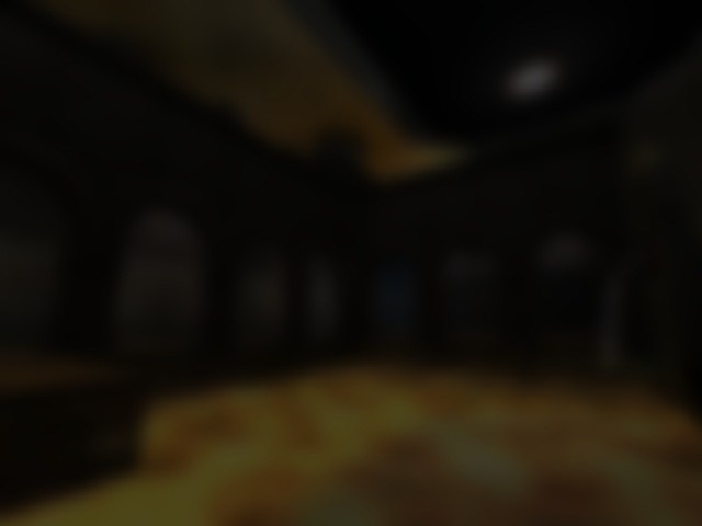
Secondly, the blue circular grill that the lightning gun was sitting on also stood out; why not create some electricial waves emanating from a circular grill on the floor up to the roof instead (only a suggestion).
Below are some ideas which may enhance the gameplay and flow of the level.
The removal of the two central supports that prop up the platform above the small pool and the repositioning of the other four may reduce congestion in this area. The large, classical, stone columns in the upper section look nice, though the removal of one pillar from the balcony overlooking the small pool may improve flow.
The corridors behind the balcony are tight and expanding these would reduce problems in this area.
The Rail gun platform and the section behind it were very cramped and severly hindered freedom of movement and need re-structuring.
The small set of stairs just after one of the curved glass tunnels could be dispensed with and replaced by a suitably inclined ramp instead, as this would speed things up.
I kept bumping into the edges of walls in some corridors and began to suffer from claustrophobia, so I think that enlarging their width would improve gameplay and permit less restricted movement.
(Note to self - you're not really going to post this load of waffle: are you?)
No, your comments weren't too harsh at all. All mappers need feedback and your reviews of this map and others are excellent and helpful. We need people to give us this sort of detailed criticism and sometimes we need to be told things straight.
Often we won't agree - at first - but after a little we start to think, "maybe they were right about that." So keep up the good work.
I am continuing mapping: latest map "nebulosity" was released a couple of weeks ago and should be up for review here soon-ish.
Continue mapping as it's nice to see something different, as opposed to the usual batch that we are normally subjected to.
Though remember that a successful combination of styles is difficult to achieve.
But, I take your pointers on, Glassman and Horatio. I don't think I got it quite right.
Thanks for the feedback, keep it coming.
Bot nightmare level are very nice ! bye
So, yes, the architecture is 'eclectic'. But don't blame fatmanfat. He's just reflecting what modern architects are doing to us (see also under 'Louvre, sticking a pyramid in front of the').
Some of the shader effects are very cool & original. I know you will learn a lot from making this map & go on to make better stuff :)
Gameplay in your map will be hindered, due to certain areas of the map being too cramped, especially parts of the upper level. Another feature that also hinders movement is the inclusion of too many columns and supports, as they normally just get in the way - they need to be included in this case, but use fewer. Archways around the pool didn't cause any problems surprisingly: well done.
Author has some good ideas, though needs to hone his mapping abilities quite a bit and learn valuable tips from other maps that consistently receive high scores.
SCORE: 6 (mainly for creativity)
Need to play it against some humans before I score it but it definitely has a couple of cool unique elements in it.