Be sure to submit your comment
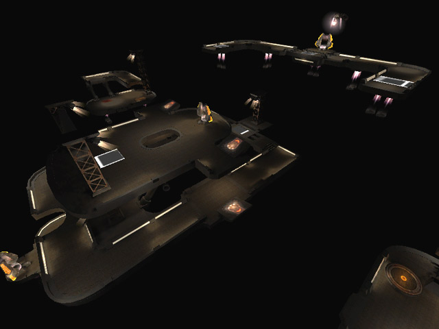
Was the author's aim simply to make the map look 'groovy' by setting it in a black and white mesh??
Oh yes and the layout sucks too.
Could one of those missing textures be...oh i dont know the blackness of space. Nope sorry i got just a simple and damn anoying grid insted.
The frame rate was in the 20s for some part wich for me is not ok.
If this map had even a feel like it was finished i would rate it ...until then ...its pure ass.
A WHITE LINED GRID IS NOT A BLACK SPACE TEXTURE!!!!!!!!
hubba hubba hubba
-make the level MUCH brighter, it's that dark it hurts my eyes. I know this takes a lot from the atmosphere, but it improves gameplay
-you have to rework your curves. There are a lot curves that add to the tris_count, but that you actually never see.Example: the cylinders you made and capped (the ones that hold the supporting-cables) have caps on both side. You can delete the side you don't actually see. The same is true for some other curves on the walkways.
-your map is very flat. While adding vertical action to a normal map is hard, it's very easy to make in a floater map. Use the freedom you have in a space map.
-You problably can't do anything about the bad botplay
(after 5 mins. of playing:
me 11 bot1 -5 bot2 -6 bot3 -11 bot4 -15)
The missing textures are from the twpak0.pk3 btw.
