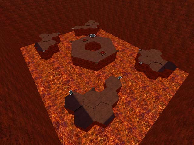
Pillars of Hell
Pillars of Hell by Kneecapt
Comments
Add a comment
avatar
**Preview only**
Be sure to submit your comment
Formatting help
Submit
Preview
Cancel
Submitting comment...
avatar
Geniraul Rep. 1709
#17   29 Aug 2024
There's a map that is very similar to this one and is not listed on ..::LvL , yet: BSH3RA1 by [BSH]Thrasher. It's much simpler, but does represent a box with lava and four platforms with a construction in the very middle. Considering the dates of both maps stated in the correspondent readme files, the author might have been inspired by this release (PILLARS).
Agree (1) or Disagree (0)
avatar
HelterSkeleton Rep. 6698
#16   28 Aug 2024
the gameplay is not bad considering that it's a box. the biggest problem here is the bouncepads: both their size and placements having you land on them and then bouncing back into the lava between platforms. modelling rocky walls with ledges and some shards/bubbles could have also made better use of the theme and the space. aside from that, it could stand as is as a passable map.
Agree (2) or Disagree (0)
Rave unregistered
#15   23 May 2000
Nothing at all has over 13500 downloads. highest of all.

wow but it is pretty good.

I forgot mentioning one thing yesterday, when all my troubles seem so far away...

I'm glad kneecapt, that you reailsed you made a mistake.

'cause there are idiots out there who just don't...

and you're not one of them..proove it! with your next map!

Agree (0) or Disagree (1)
not entered unregistered
#14   22 May 2000
Also check out 'Nothing at all' on LvL, as it is one cool map with great gameplay.
Agree (0) or Disagree (0)
Kneecapt unregistered
#13   22 May 2000
Cheers to everyone for the recommended maps! I already had a few of them but I got the rest mentioned here. My latest map that plays pretty well (but still doesn't look that good) is kinda similar to the sewer map of kingpin in the form of connectivity. I've had an idea for a ctf map which has the red base as a gothic map leading to a blue industrial base via jump-pads through tunnels that I want to get looking like warp gates for star trek/Babylon 5. It'll probably be some time before i can bring this of but I intend to get there! I've got a week of work next week, so thats some serious time i can get in :)
Agree (1) or Disagree (0)
OO7MIKE unregistered
#12   22 May 2000
Lets all join hand for a prayer........A Box......Amen.

It seems that i have been forsaken today. 2 maps so far have those damn white grid textures. I hate those!

Is seems that 2 maps have also not been completed.

I was not ever bothered by the 4 other padds and didnt feel like i needed to go anywhere else but where i was.

OO7MIKE's sergion generals warning: Playing this map can cause extreme lazyness and can induce a trance like state that can lead to extreme time to sleep ratio.

Agree (0) or Disagree (1)
Rave unregistered
#11   22 May 2000
Sigh i don't believe what i just read. I'll give it one last try, especially to captain horatio...:)

What I was trying to say here, was that Kneecapt should build something good! not to throw in the towel, well not if he defenitily wants to create a good map. ok?

Sometimes i feel like that drill sergeant in opposing force...i mean that hothead doesn't stop screaming untill you succeed in what you do? ;)

I hope everyone finally understands what I'm trying to say. Sometimes you just have to be hard on people.

You eyeballing me maggot??? ;)

Agree (0) or Disagree (1)
Niven unregistered
#10   22 May 2000
The sad part is that good maps like "middle.pk3" are still waiting for review while one room levels are appearing pretty much every week.

Agree (0) or Disagree (0)
Steinecke unregistered
#9   22 May 2000
Good maps? 'Sinister Purpose'; 'Revelation'.
Agree (0) or Disagree (0)
Captain (Horatio) Chaos unregistered
#8   21 May 2000
Ok, I only want one kneecap now.

At least you made an effort to construct something, so don't go throwing in the towel just because of our comments.

In my opinion a good map should have a well structured layout; excellent connectivity; should also be two or three storeys high with views over lower decks so as to encourage vertical gameplay; a balance in weapons and powerups included so as to prevent easy domination of a map; and definitely some well designed custom textures. Tig's-Den has a great layout and perfect connectivity; PQArena boasts a superb layout and gameplay is awesome; for textures, check out any map by Mr Clean & Meat as these guys produce magnificent work. Use search feature of LvL to locate the examples given.

If at first you don't suceed, please give up, hehe!

Agree (0) or Disagree (0)
Kneecapt unregistered
#7   21 May 2000
I totally agree with everything Rave said (except the bit about insulting me, I deserve it), I suprised it got put onto the site and I'm not sure why i released it. Anyway I'm currently on my 7th map and I probably won't be releasing any in the near future unless:-

  1. I suddenly get really good at those damn curves
  1. Someone magically finishes the skins I'm working on! :)
So, I've been downloading lots of maps recently and trying to see what makes the great ones great and the crap ones crap! (I don't have to look to hard on this one :>)

So I'd like to thank everyone for posting there comments and for anyone who downloaded it, I can only apologize!

Agree (0) or Disagree (1)
Rave unregistered
#6   21 May 2000
Here I am again to explain what i said earlier. I do not tend to insult anyone, that would be like....stoopid! :)

But if it is his first attempt( ho boy and what a first attempt) why...for crying out loud..didnt he rebuild it again and again, worked on it on his hard disk??? WHy putting a piece of crap like this on the net? no answer!

I got to admit, when I was a newbie in level editing, my first map looked like utter crap (in quake 1). But not in a hundred kazillion years would i have put it on the net! Why? because it just didn't cut the cheese..uhm u know :B

If you want to release a level, then make it worth it! Put effort in it! This is what many peeps will see! SO important!

I won't cut the guy some slack, 'cause it just ain't done..putting something like that on the net. If it is an exercise, well he should have worked on it at home!!!!

much work! much! hehe u know what i mean grr

I hope everybody understands what i am trying to say. I personally still have to learn how to work with qradiant, but I'm willing to take my time and built a good level or at least try :)))

Who can say?

First levels should be like this:

Nice maps, maybe simple, and that's not a bad thing, but challenging.

I truly hope kneekapt will work on his next level.

Else he can take his place on cranky steves'site!

Besides i've had it with those stupid 1 room levels! It's just too simple. A level like id's the camp grounds is fun, 'cause you can hunt your prey down!

and that's fun!

captain horatio, don't cut guys like this some slack. Cause it will encourage others to deliver boxes like this over and over (!!!!!!!) and the author of this thing, won't feel like he has to make anything better!!!

It's a saaad saaaad planet

Agree (0) or Disagree (1)
ocamsrazor unregistered
#5   21 May 2000
Come on, its probably his first map, and i found it quite a good 1on1 map. but thats just me :-)
Agree (0) or Disagree (0)
LunaChick unregistered
#4   21 May 2000
This is CRAP!

whatthe hell is this, in all seriousness? 1 room, with lava and sky, WOW! what a technological breakthrough this lvl is. NOT! damn, this is crap, why? why? why?

Agree (0) or Disagree (1)
Captain (Horatio) Chaos unregistered
#3   20 May 2000
My first thoughts on this map, were Kneecapt the author of this sad, sad level. On second thoughts, I concluded that this was too harsh and it may be this guy's first attempt at creating arenas and so we should cut him some slack. There is no need to make such nasty comments even though this level is dire, but the creator should try and develop his skills at using Radiant before releasing his efforts, as otherwise they will just be met with scorn.

Ah! Forget this malarkey, Kneecapt the geek and be done with it.

Hehe(Only joking).

Agree (0) or Disagree (0)
naborro unregistered
#2   20 May 2000
Well, why LVL put levels like this? the autor just want to make a joke... buagh!!...
Agree (0) or Disagree (1)
RaVe unregistered
#1   20 May 2000
This is really sad. I mean what the hell? Are there that many lazy peeps out there who have the nerf to send in these crappy stupid maps???

I guess you can enjoy this map when your brains are on the wall.....

This was hilarious to look at in when "Doom" was going around,

but now, with the fantastic quake arena engine, making shit like this...

There is no excuse at all. This is pure being lazy!

Shove it!

Agree (0) or Disagree (1)
Clear